Design system · My own product
In progresstend design system
Colors, type and components for my own app, built for light and dark from day one.
Overview
System first, screens second
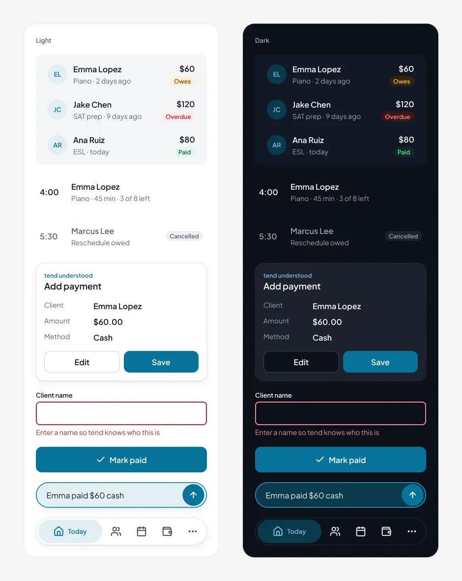
tend is an app I’m building for solo workers to keep track of clients, appointments and payments. Before drawing real screens, I set up color, type, spacing and the core parts. Dozens of screens later, everything still matches.
01 · Color
Brighter, until it broke
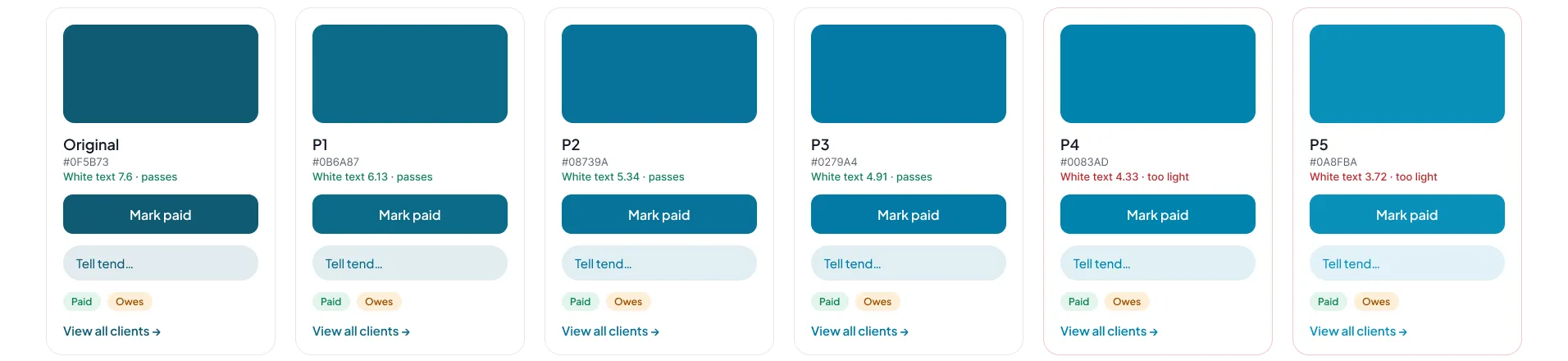
I picked petrol, then pushed it brighter one step at a time. The limit was readability: white text on a button needs 4.5:1. P4 and P5 looked great but failed, so I stopped at P2 (#08739A), the brightest step where petrol text on its own light tint still passes too.
02 · Light and dark
Same tokens, second mode
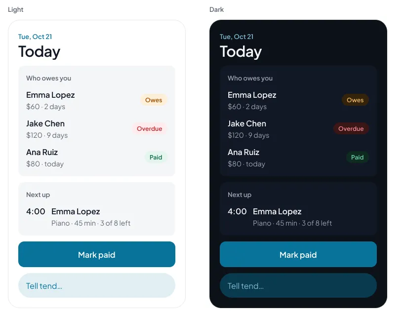
Every color in tend has a light and a dark value, so switching modes never breaks a screen. I checked every key pair in both. One failed: the green Paid text in light mode was 4.3:1, so it moved to a darker green.
| Pair | Light | Dark |
|---|---|---|
| Main text | 17.7 | 17.5 |
| White on petrol button | 5.3 | 5.3 |
| Petrol text | 5.3 | 9.2 |
| Paid | 5.8 | 8.3 |
| Owes | 5.5 | 8.5 |
| Overdue | 5.1 | 6.9 |
03 · Components
Parts for a busy day
Buttons, status pills, client and appointment rows, the chat bar and the tab bar. Each one is built from tokens only, so it works in both modes without a second version. The button alone has 24 versions across style, size and state.
- 35color tokens
- 2modes, light and dark
- 24button versions
- Button
- Status Pill
- Avatar
- Client Row
- Appointment Row
- Text Input
- Chat Bar
- Confirmation Card
- Tab Bar
- Toast
- Chip
- Segmented Control
- Calendar Event
- Transaction Row
- List Row
- Card
04 · Figma to code
Same names in the prototype
The coded prototype uses the same tokens as CSS variables with the same names. color/bg/brand in Figma is --color-bg-brand in code. Dark mode is just a second set of values for those same names, so no screen needs its own dark version.
| Figma | Code |
|---|---|
| color/bg/brand | var(--color-bg-brand) |
| color/text/paid | var(--color-text-paid) |
| color/bg/elevated | var(--color-bg-elevated) |
| color/border/focus | var(--color-border-focus) |
05 · Where it stands
What’s next
Next up is testing with real people. Whatever I learn will change the screens, and the system is set up so those changes stay small: fix a token or a component once, and every screen follows.
More work
 nutuHelping a nutrition app grow into a metabolic health platform
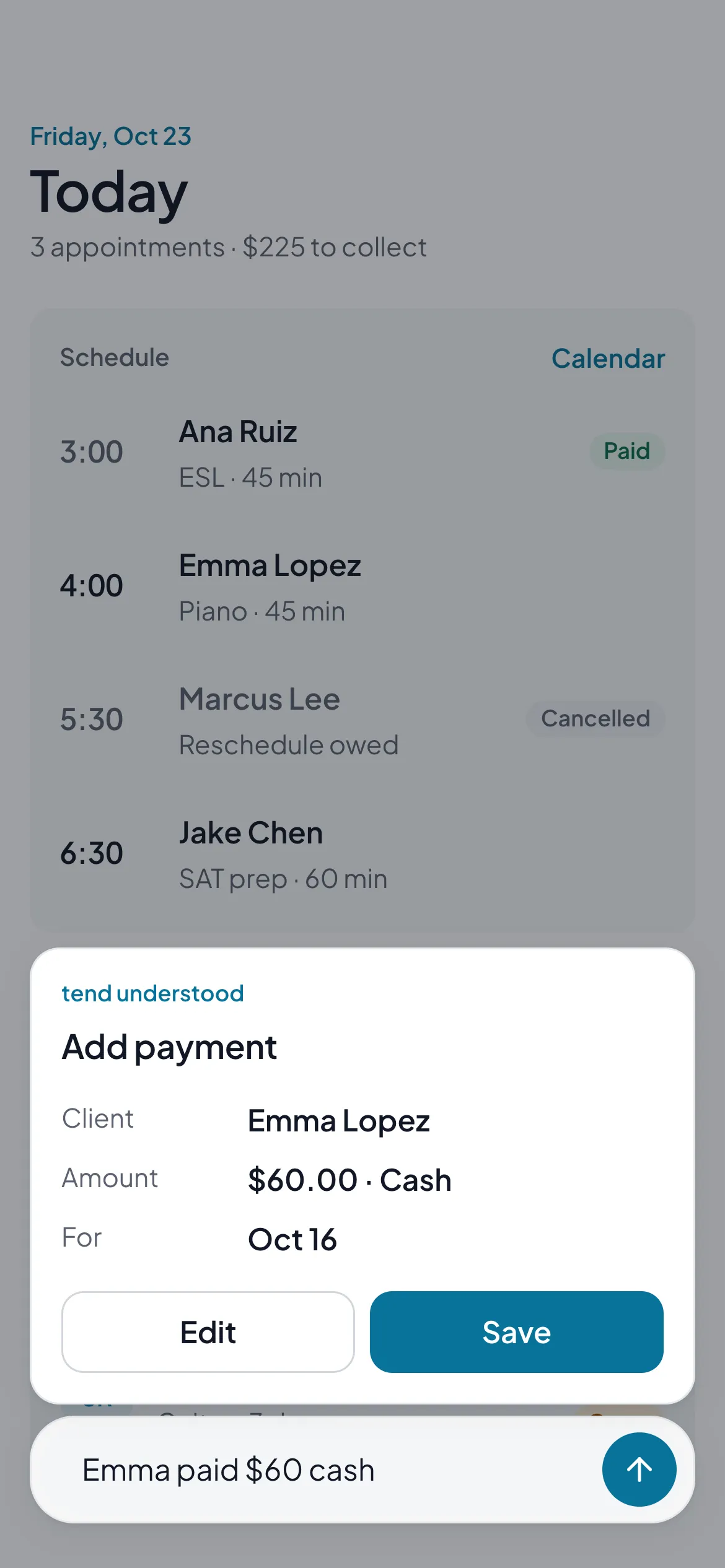 tendA simple app for solo workers to keep clients, appointments and payments in one place
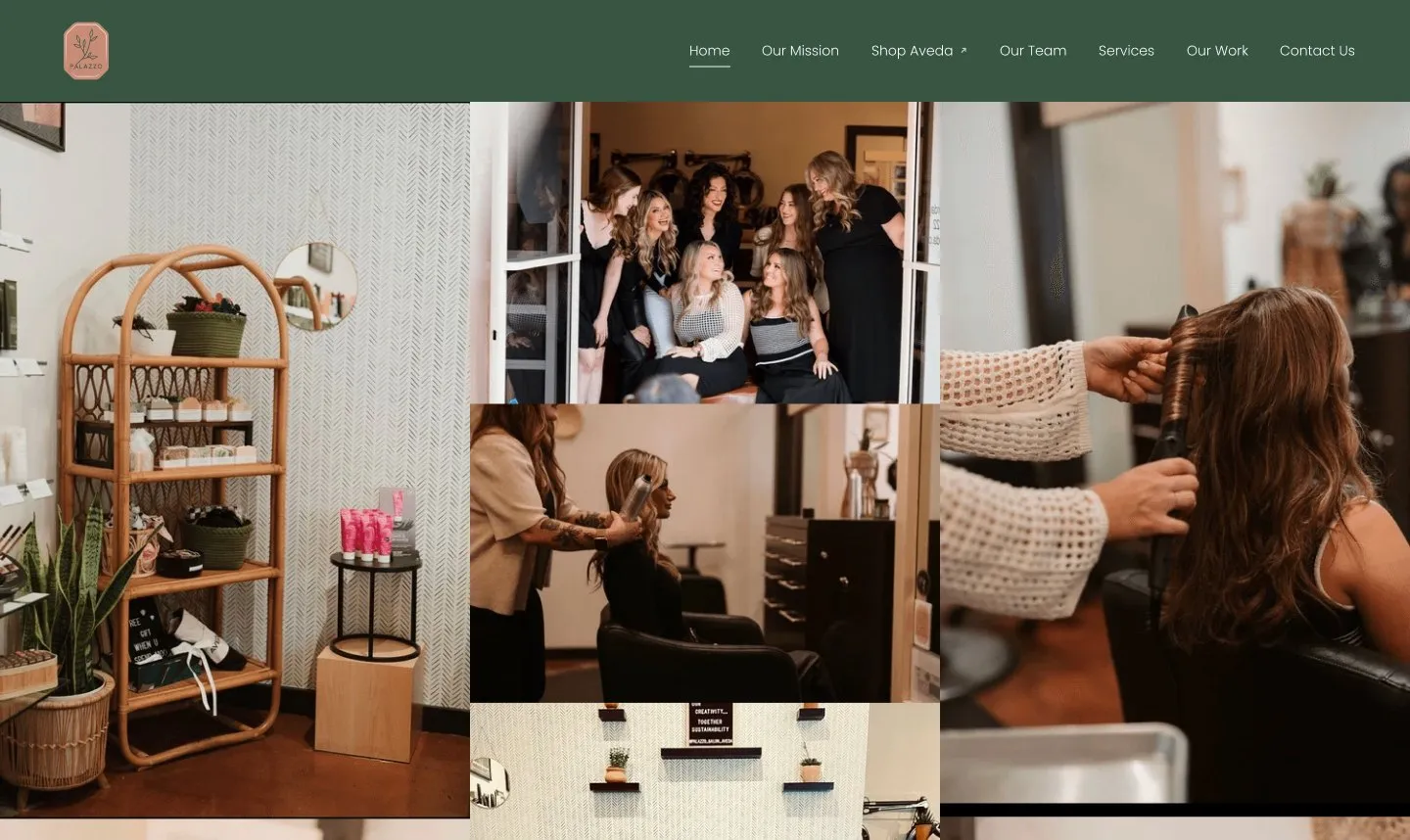 Palazzo SalonA clearer, easier website for a salon in Redlands
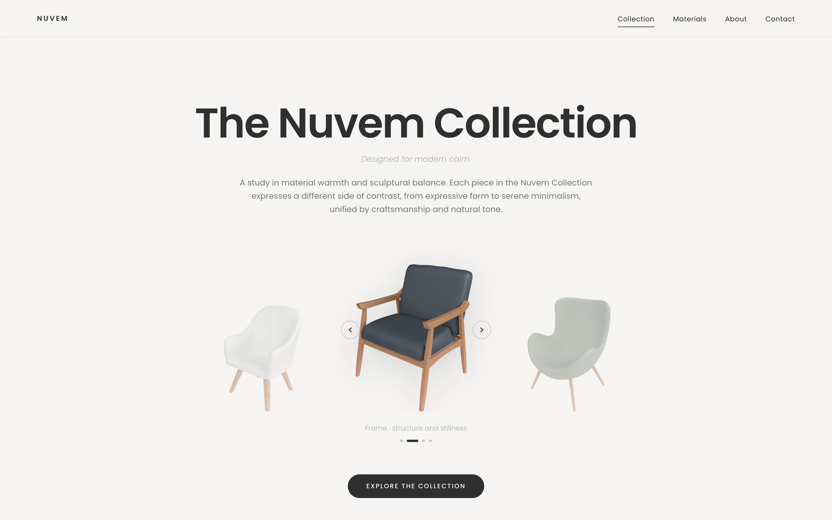 NuvemA calm, sculptural site for a furniture collection
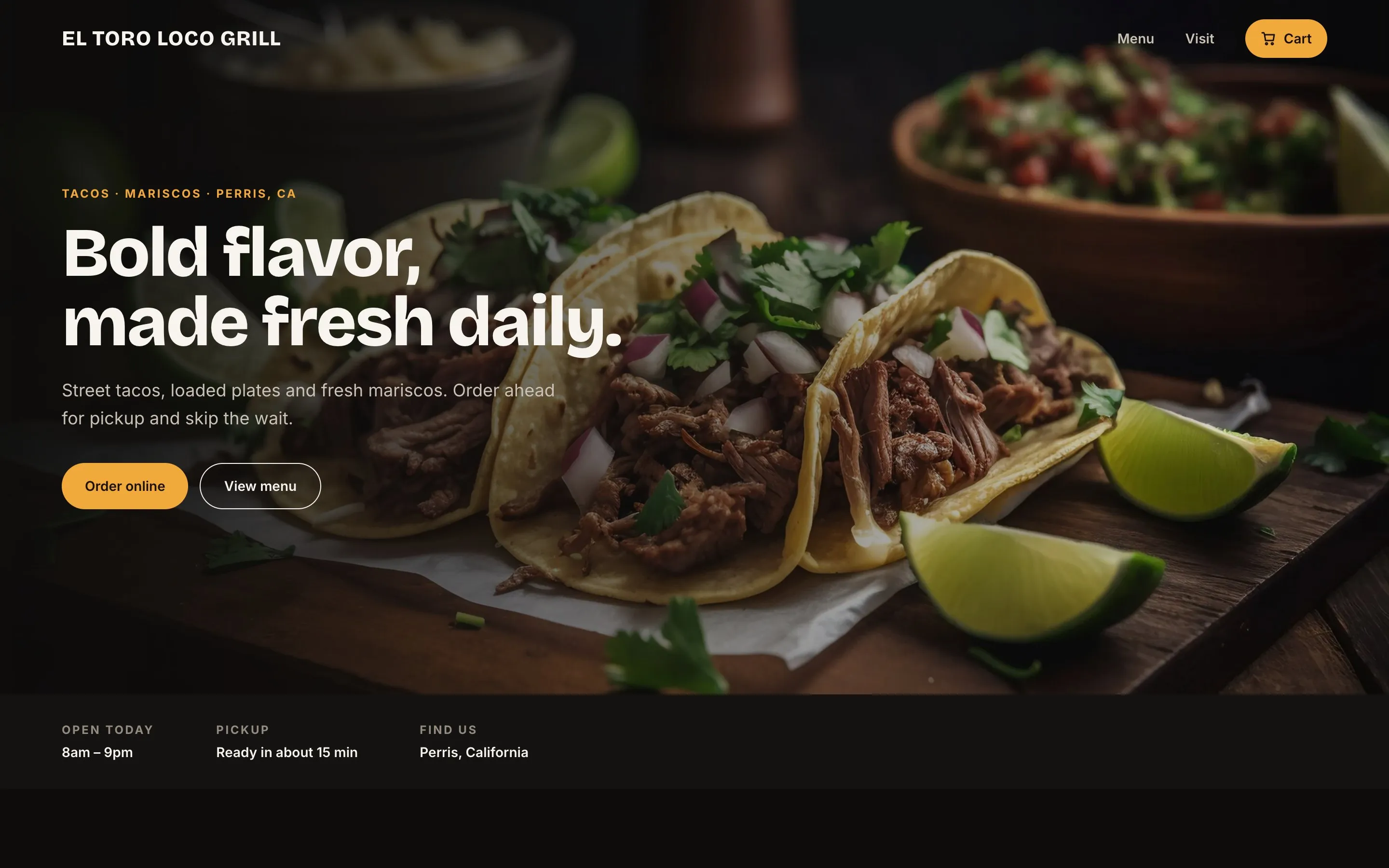 El Toro Loco GrillA taqueria’s website and pickup ordering, redesigned from the order up