Design system · My own work
Portfolio design system
The system behind this site. One set of tokens and components, named the same in Figma and in the code.
Overview
One place, not five
This site shows very different work: apps, websites and videos. I wanted it to feel like one place, not five. So I built a small system first. Tokens for color, space and type, plus a set of components, all set up the same way in Figma and in the code.
01 · Structure
Two layers of color
Primitives are the raw values, like neutral/900. Roles are what the rest of the site uses, like color/text/primary. Components only ever use roles, so changing a color is one edit, not a hunt through every page.
| Primitive | points to | Role | Used for |
|---|---|---|---|
| neutral/900#111110 | color/text/primary | Headings and body text | |
| neutral/600#52524E | color/text/secondary | Descriptions | |
| neutral/25#FAFAF9 | color/bg/page | Page background | |
| orange/500#DE6E21 | color/accent/brand | Card arrows, the playing outline | |
| orange/700#9A4511 | color/accent/text | Active tab text, section numbers | |
| orange/50#FBEADF | color/accent/subtle | Active tab background, this panel |
02 · Decisions
Every token has a reason
I kept a short reason next to every choice, and most of them come down to contrast. If a color can’t pass AA where it’s used, it doesn’t go there. Even when it’s the logo color.
- View work3.3:1 FailsView work18.9:1 Passes
Orange is a signal, not a button
White on the logo orange is only 3.3:1. So buttons stay ink, and orange marks things: arrows, the active tab, the playing video.
- 5.5:1 Passes
The active tab gets a tint
Dark orange text on a light orange tint reads at 5.5:1. It still feels on brand without using the logo orange for text.
A clearer, easier website for a salon in Redlands
7.5:1 PassesDescriptions are body text
Card and job descriptions use #52524E at full size, 7.5:1 on the page. They read like content, not a faded caption.
03 · Components
Built once, used everywhere
Each component has its states and sizes built in, so a page is just parts snapped together. The home cards, the case study sections and the video grid all come from the same set. Try it: the controls below switch the real Button.
04 · Figma to code
Same names on both sides
Every variable in Figma has a CSS variable with the same name, and every component has a matching file. When I build a page with Claude Code there’s nothing to translate, so the design file and the live site stay in sync.
| Figma | Code |
|---|---|
| color/bg/page | var(--color-bg-page) |
| color/text/primary | var(--color-text-primary) |
| color/accent/brand | var(--color-accent-brand) |
| space/24 | var(--space-24) |
| radius/lg | var(--radius-lg) |
| Figma | Code |
|---|---|
| Button | Button.astro |
| Project Card | ProjectCard.astro |
| Pill Nav | PillNav.astro |
| Tab Bar | TabBar.astro |
| Case/Section | CaseSection.astro |
05 · Where it stands
What’s next
The site has a Motion tab now, so motion is next: shared durations and easing as tokens, the same way color works. After that, dark mode. The color layer is already split into primitives and roles, so it’s mostly a second set of values.
More work
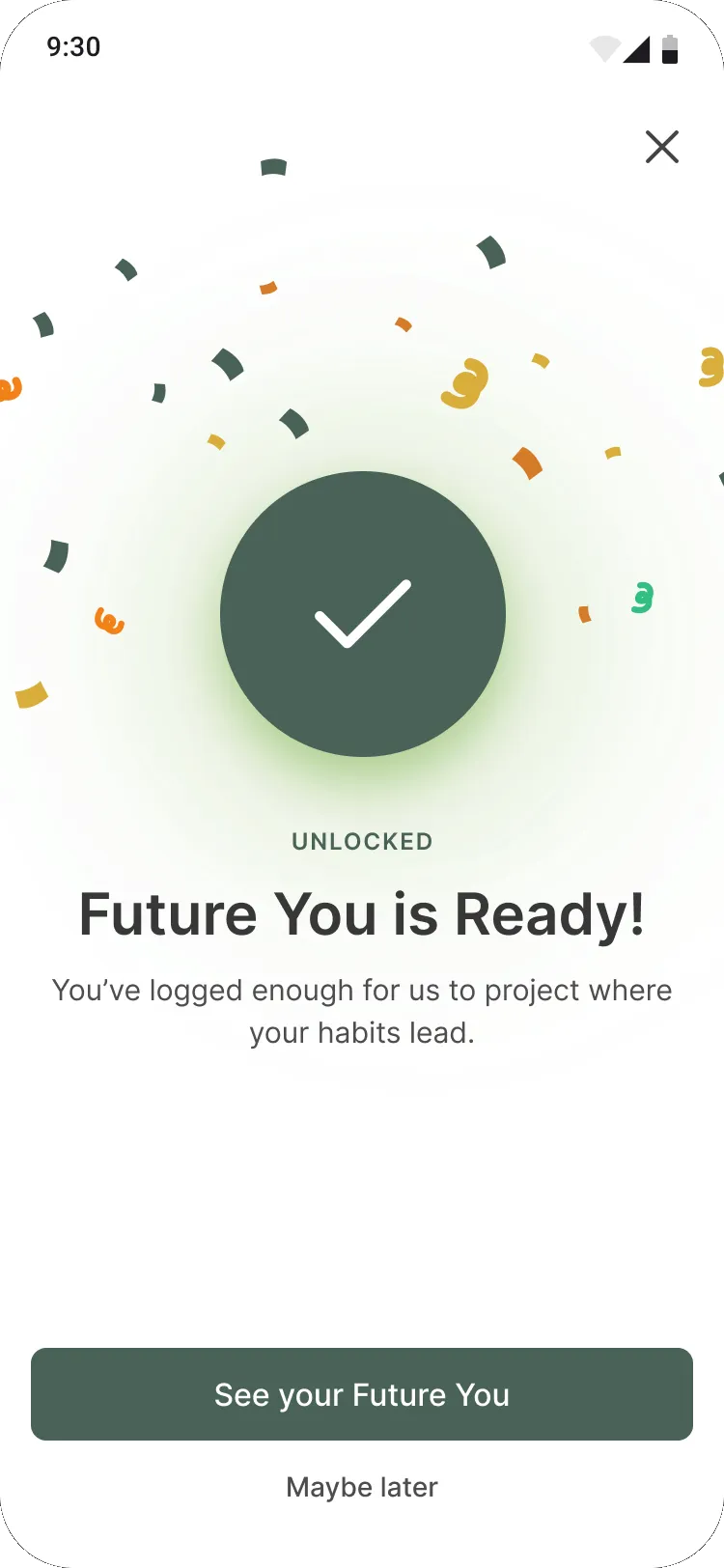 nutuHelping a nutrition app grow into a metabolic health platform
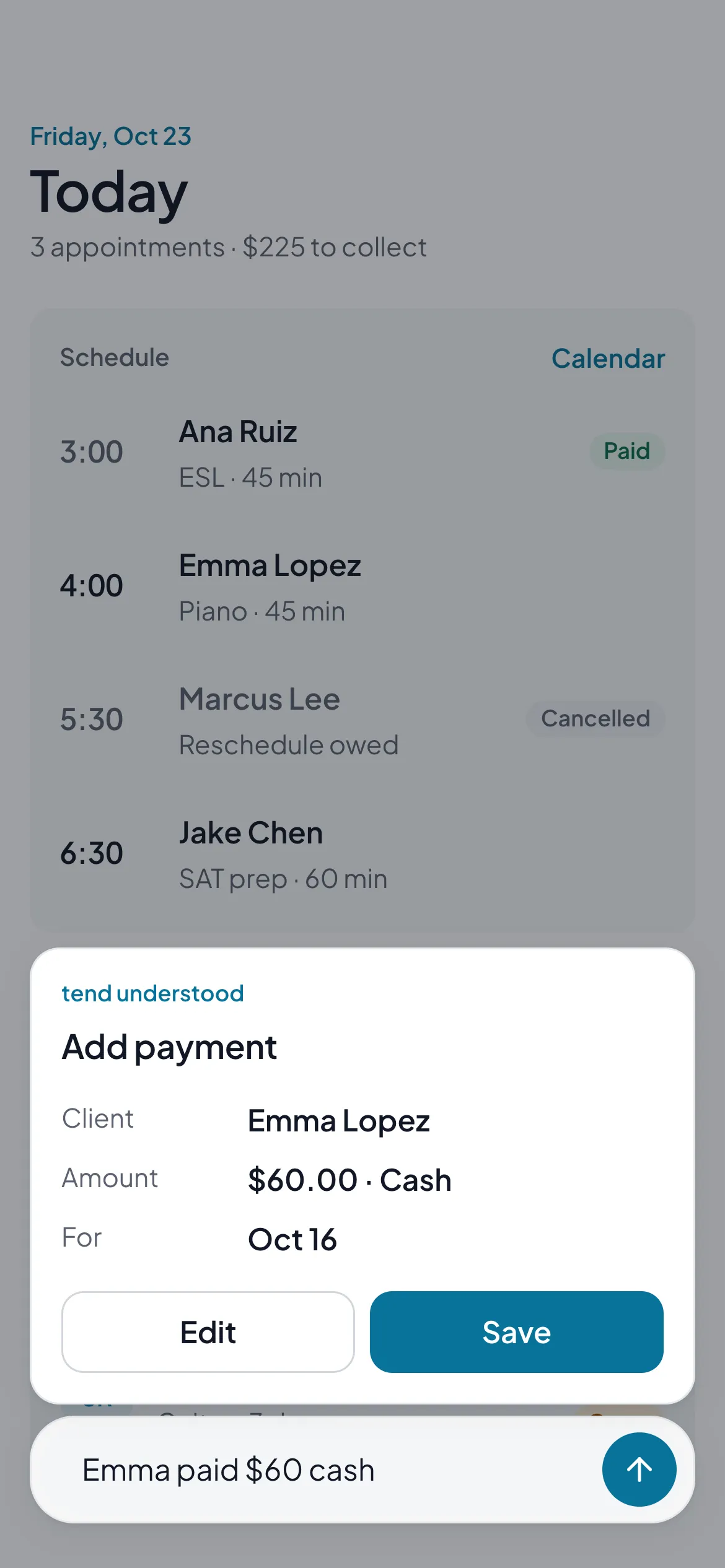 tendA simple app for solo workers to keep clients, appointments and payments in one place
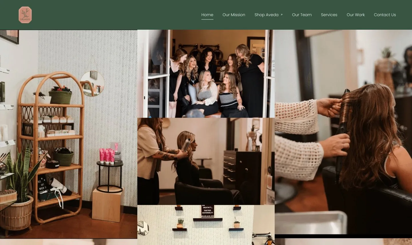 Palazzo SalonA clearer, easier website for a salon in Redlands
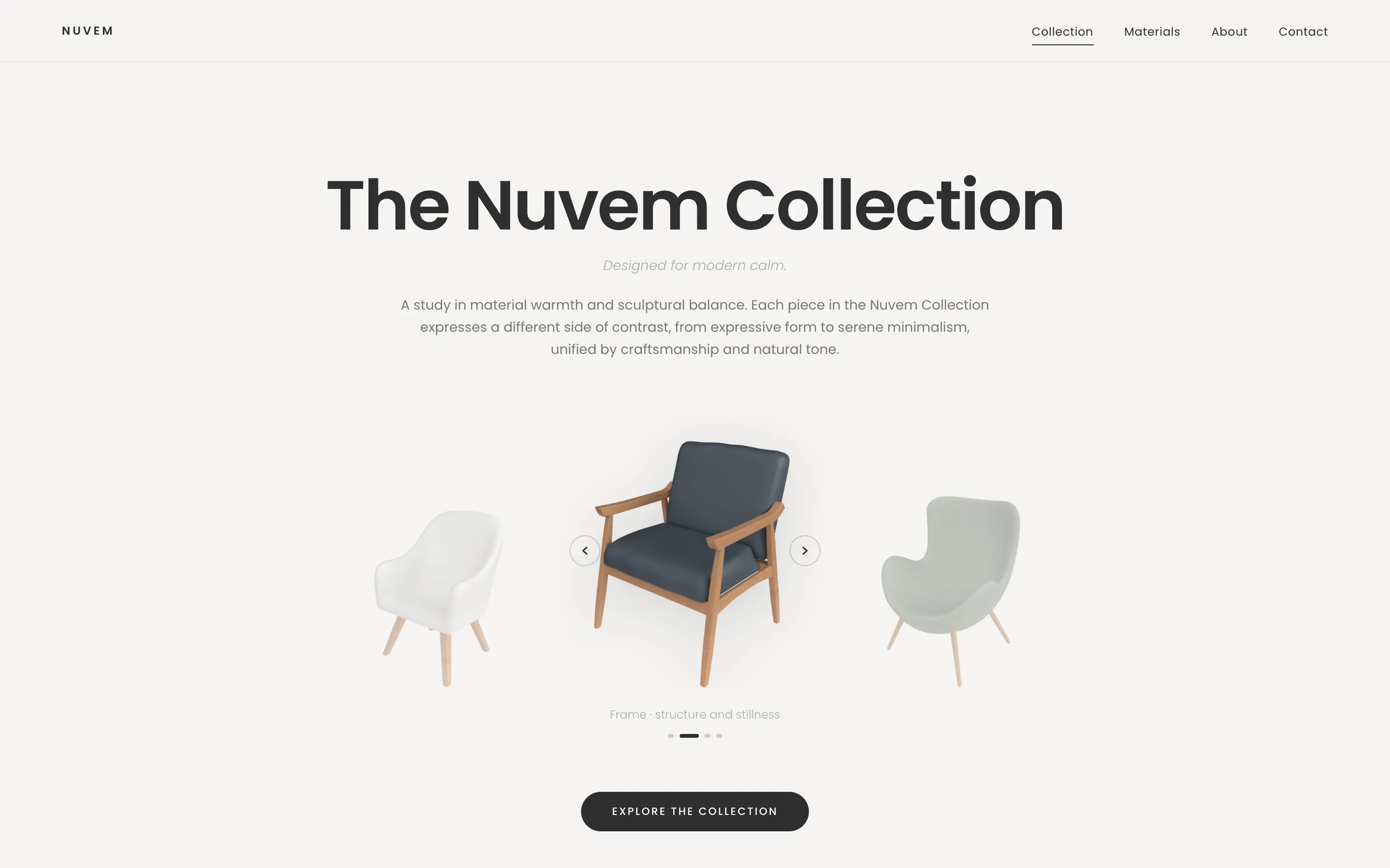 NuvemA calm, sculptural site for a furniture collection
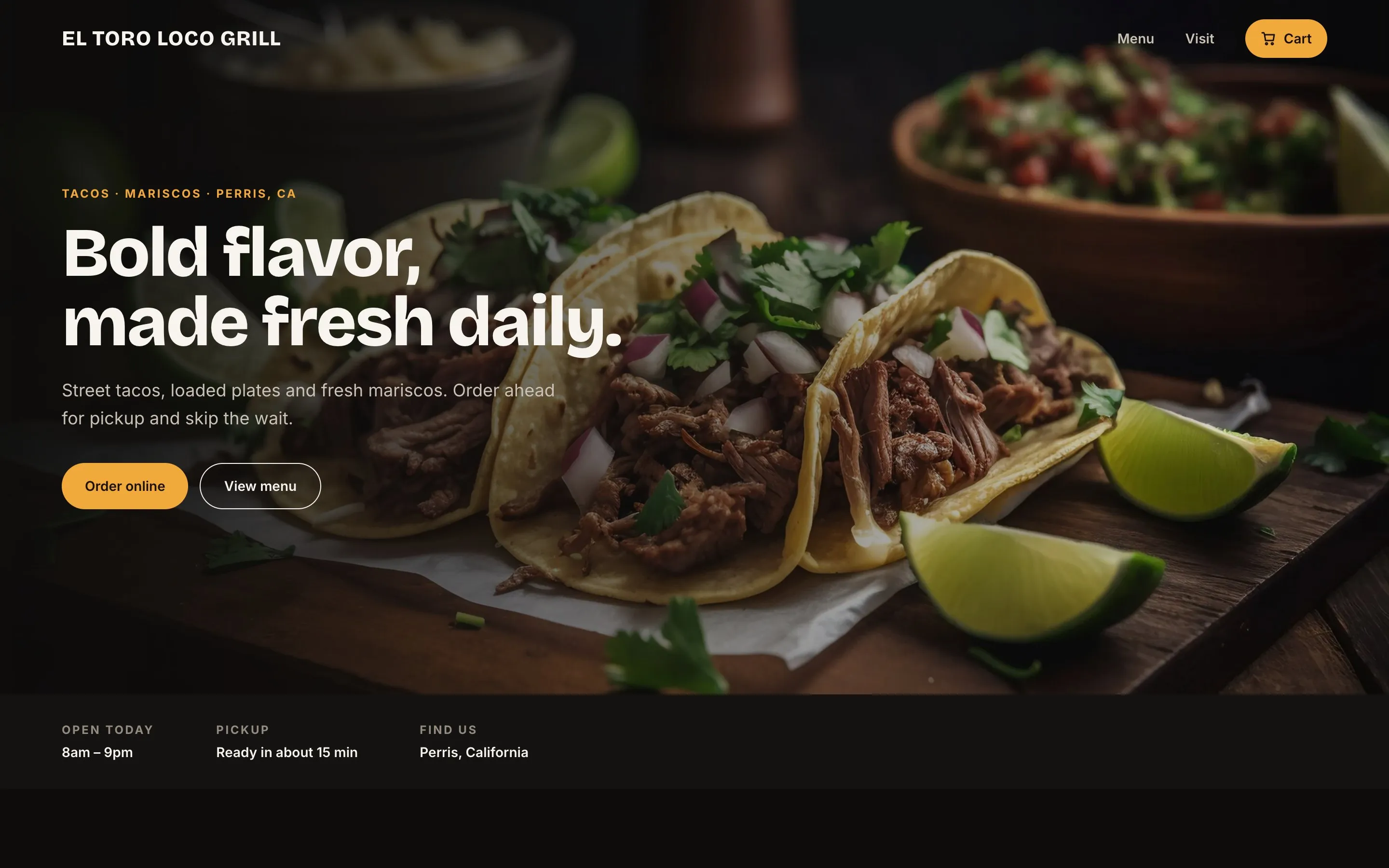 El Toro Loco GrillA taqueria’s website and pickup ordering, redesigned from the order up