Web design · Freelance
Palazzo Salon
A website that feels like walking into the salon: easy to browse, quick to find a price, and right at home on a phone.
Overview
The problem
Palazzo is an Aveda salon in Redlands, California. The salon itself is warm, full of plants and natural light, and run by a close team of stylists. Their website didn’t feel like any of that, and it made the basics harder than they should be: finding a service, seeing what it costs, and figuring out who you’d be sitting with.
Most people find a salon on their phone, usually right when they want to book. So the goal was simple: make the site feel like the salon, and make those answers easy to get anywhere.
01 · Structure
Built around what clients ask
I worked with the owners to pin down what the site needed to do for them and for their clients: show off the team and the space, keep services and prices easy to update, and point people to a call or email when they’re ready.
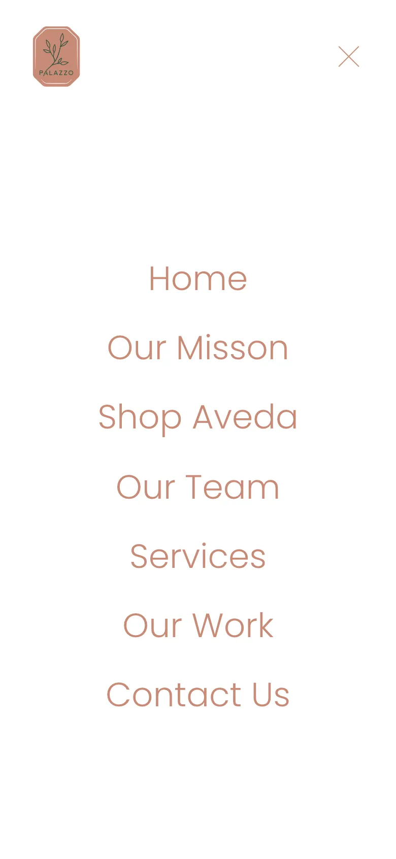
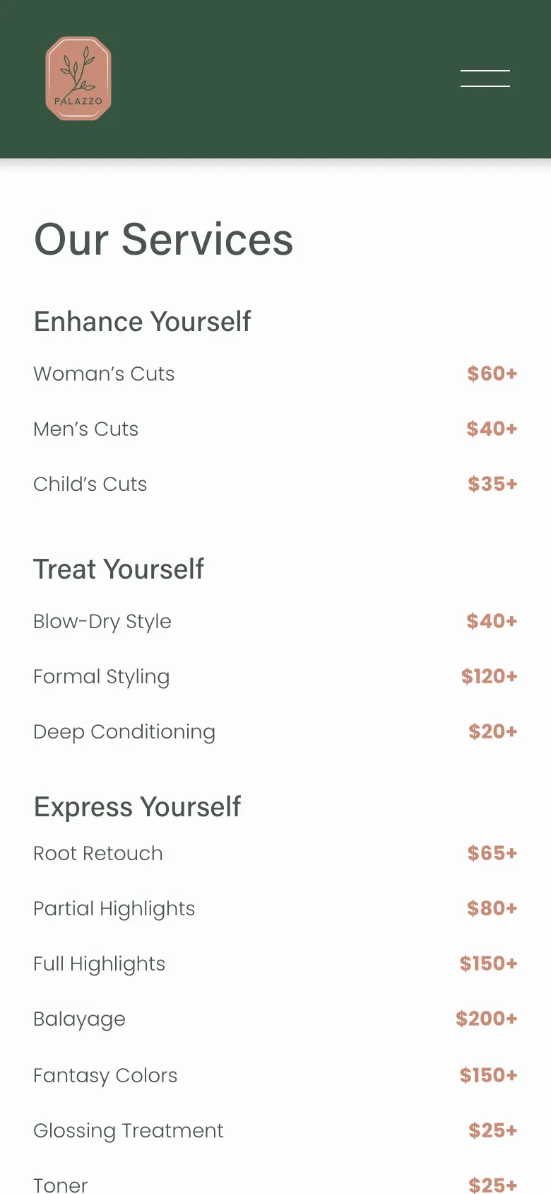
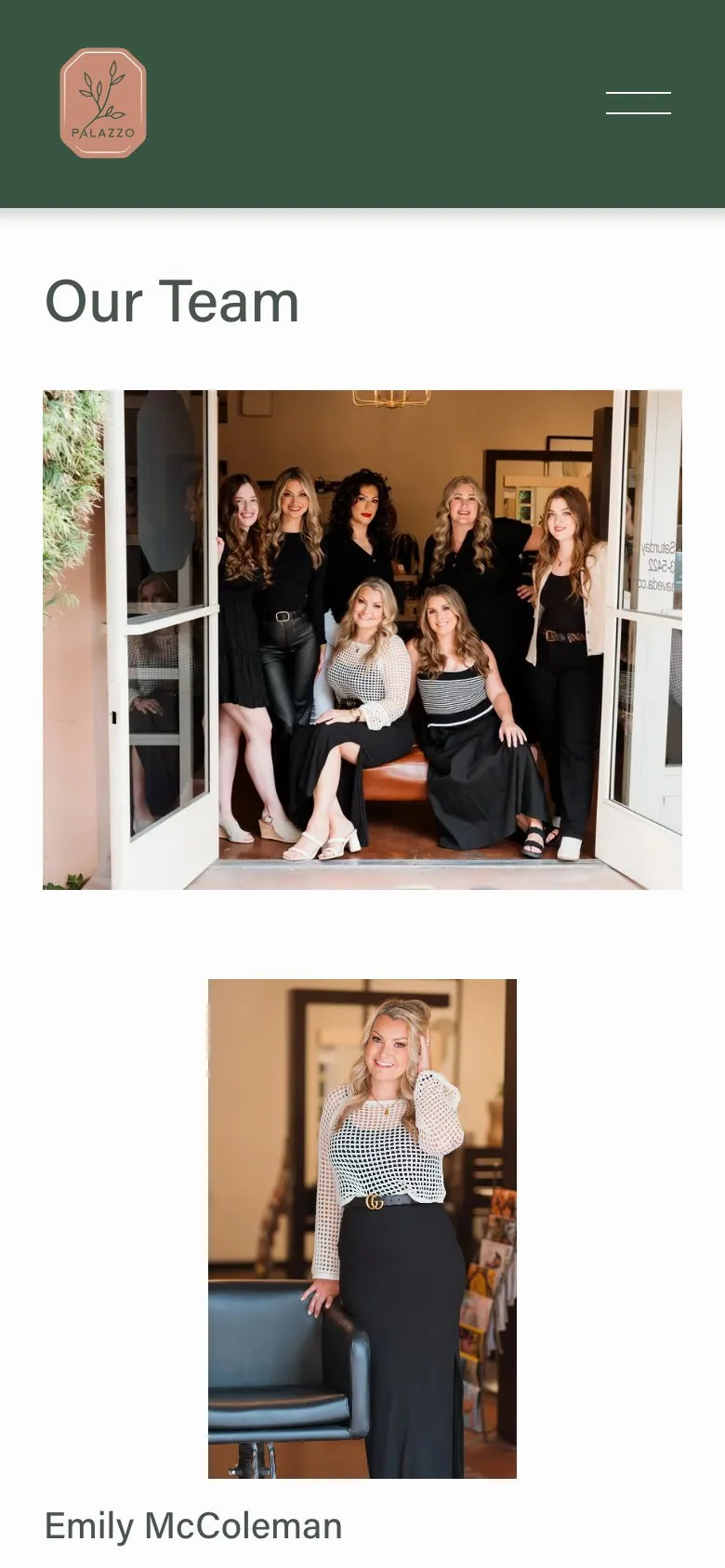
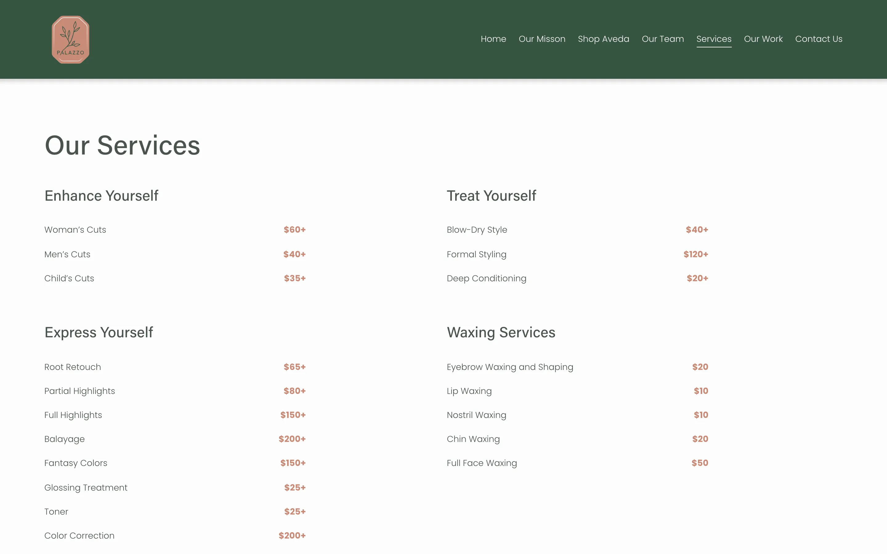
From there I built the structure around the questions clients actually ask the front desk: what do you offer, how much is it, who are your stylists, where are you. Each one became a page, and the menu reads in that order. On a phone it opens to the same short list in big, easy-to-tap type.
02 · Look & feel
Let the salon do the talking
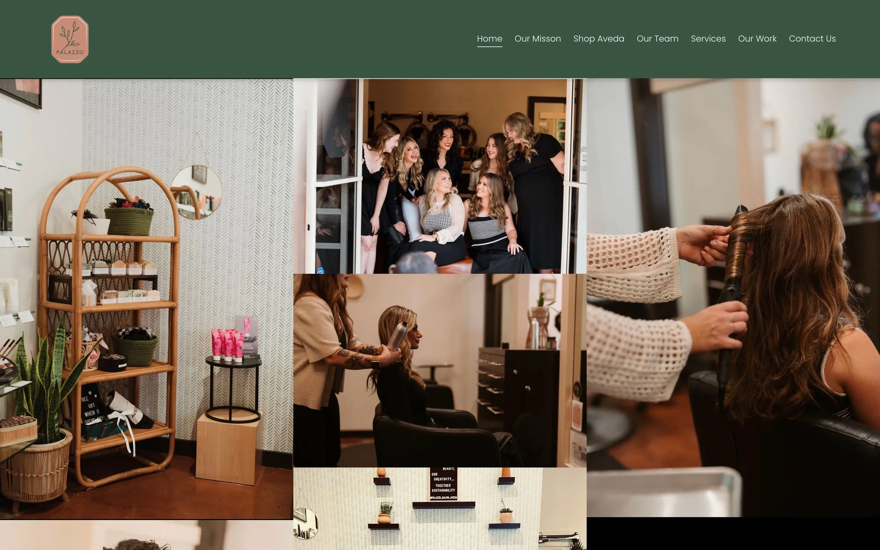
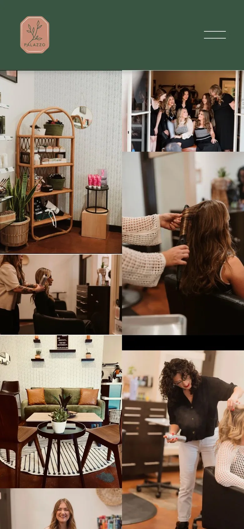
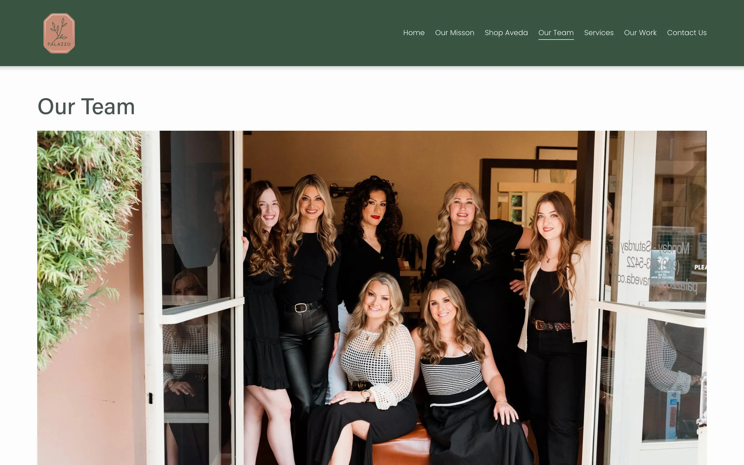
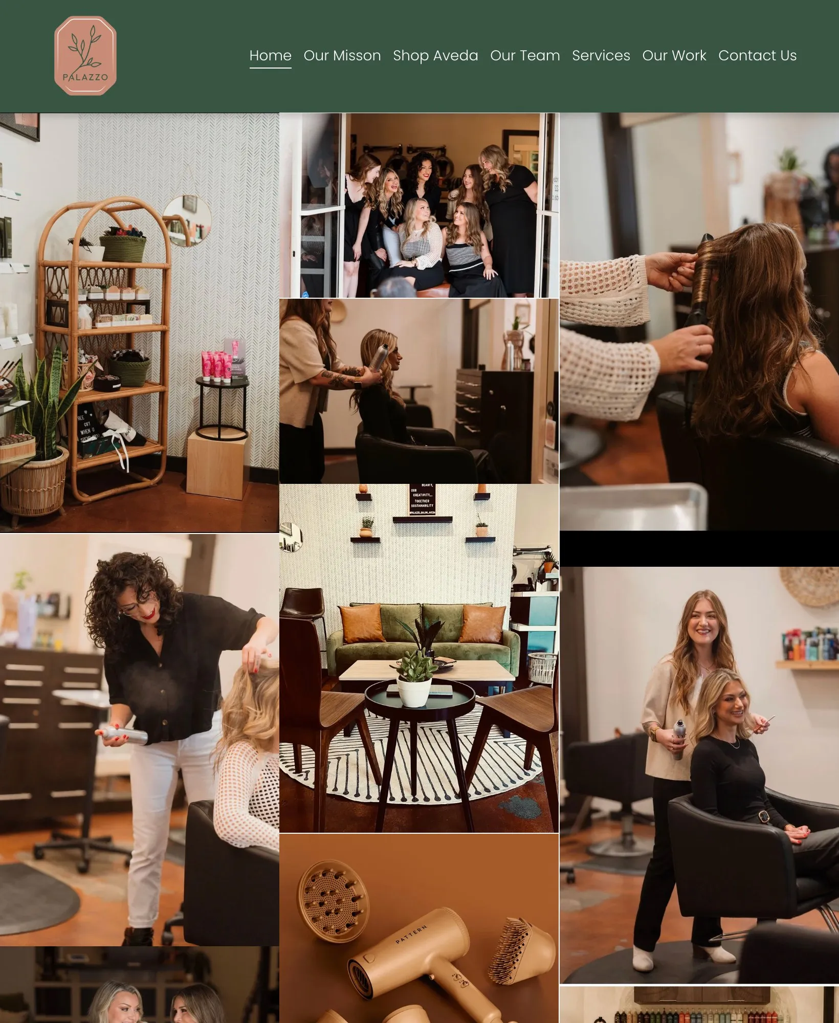
Instead of stock photos, the site leans on real photos of the space and the team. The colors come straight from the logo: the deep green and the dusty rose. Clean type and lots of white space keep it calm, so the photos carry the personality.
03 · Responsive
At home on any screen
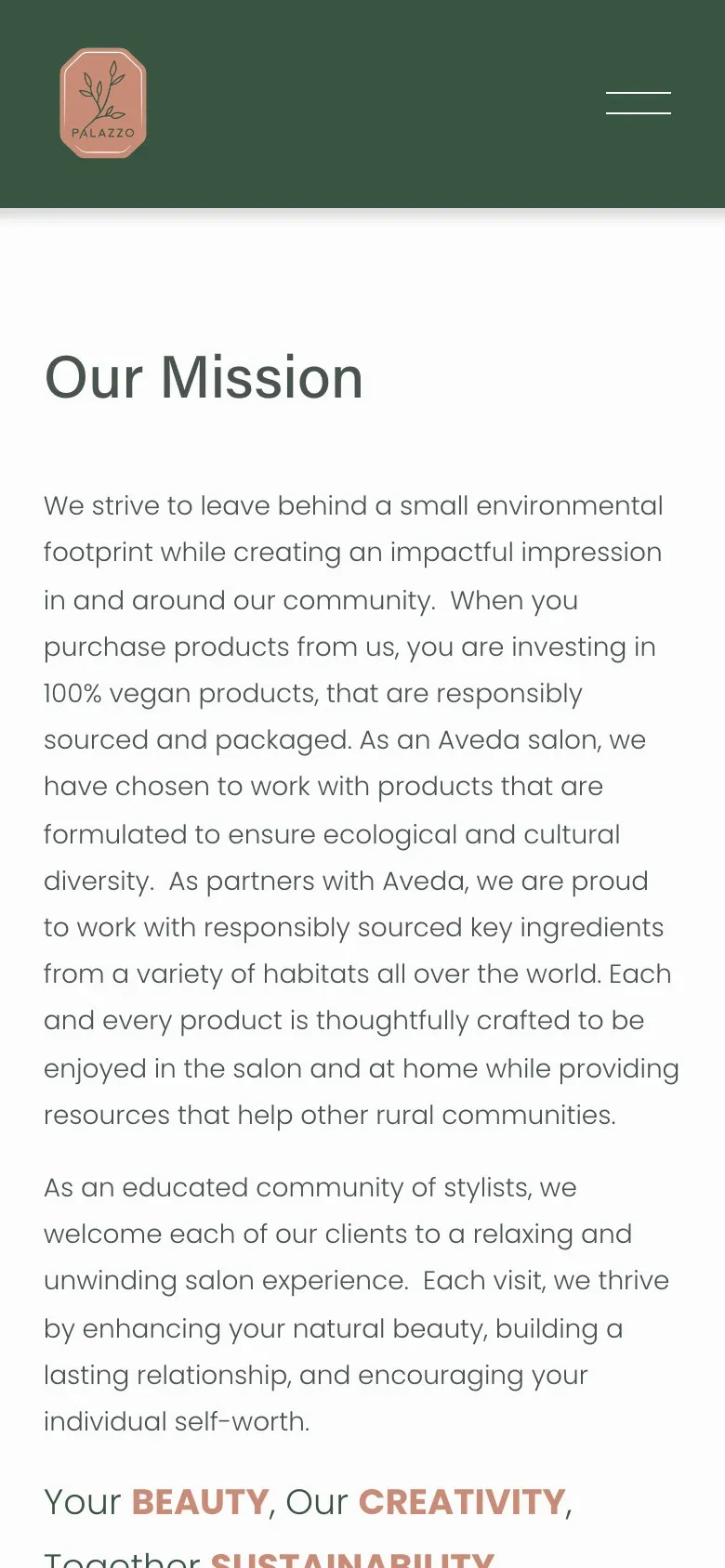
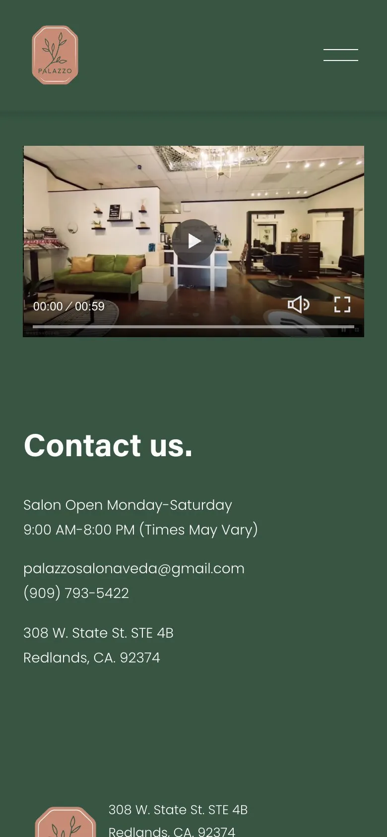
I designed each page for the phone first, then let it open up on bigger screens. The photo grid reflows from three columns to two to one, and the navigation collapses into a single menu without losing anything.
Try it: drag the edge
04 · Outcome
Where it stands
The site has been live since 2023. It runs on Squarespace, so the salon team can update services, prices and photos on their own without waiting on anyone.
What’s next: I’m rebuilding it as a custom site with AI tools like Claude Code, the same way I built this portfolio. Same design, faster pages, and more room to shape it exactly how the salon wants.