Web & ordering · Concept redesign
El Toro Loco Grill
A local taqueria with great food and a website that kind of hid it. I redesigned the site and the whole pickup order, from the first tap to “order received.”
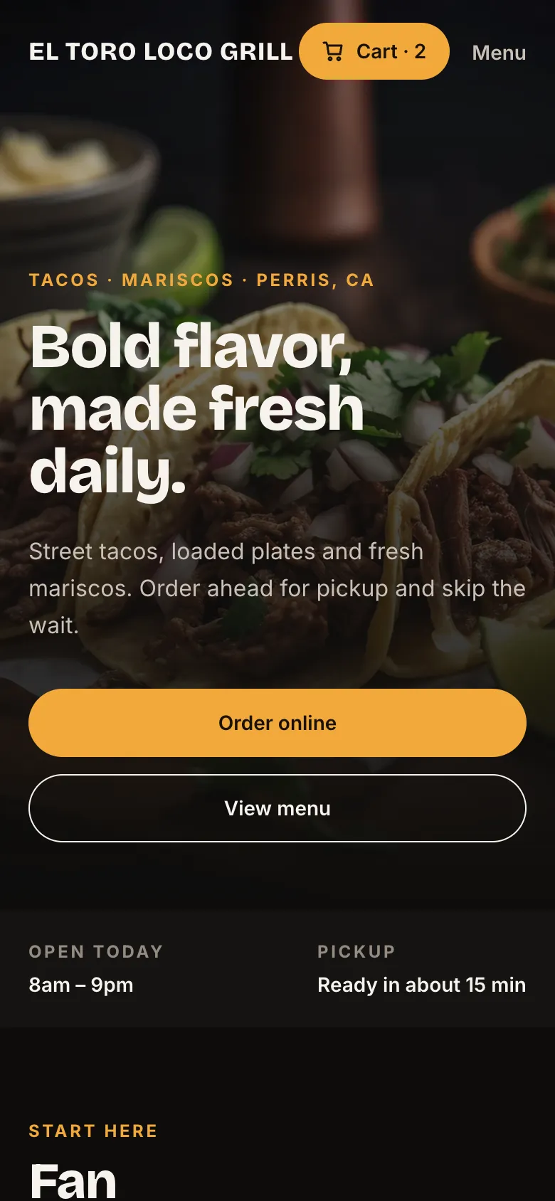
Overview
The problem
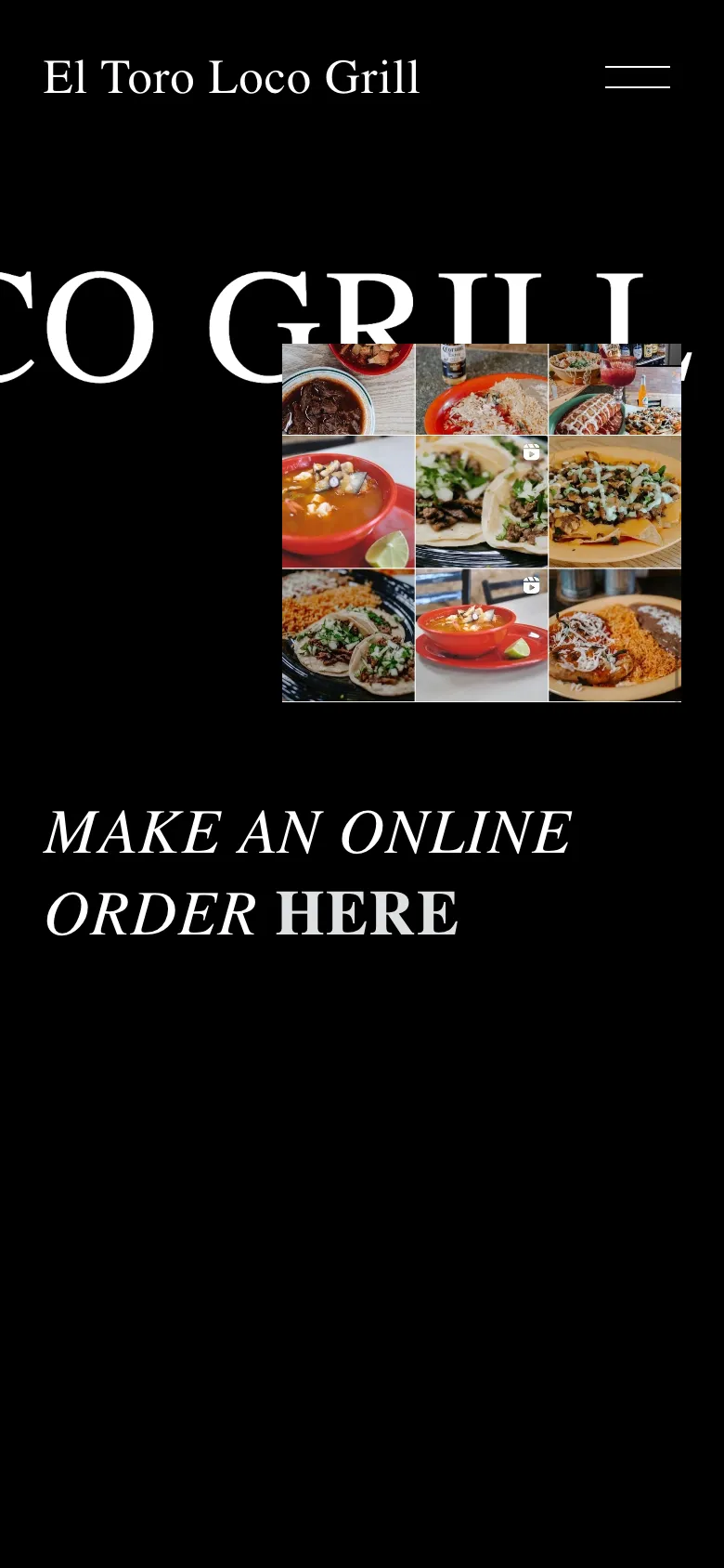
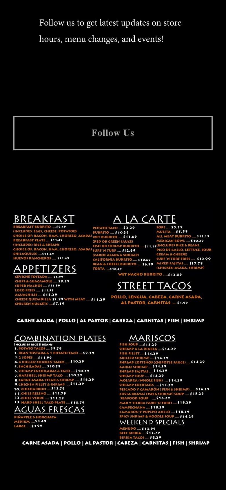
El Toro Loco is a Mexican grill in Perris, California. The food looks amazing. The website? Giant scrolling type, an Instagram feed, and the menu posted as a photo of the printed board. On a phone you’re pinching and zooming just to find a price.
And when you’re ready to order, you get sent off to a separate ordering site that looks nothing like the restaurant. I wanted to see what it would feel like if browsing and ordering were one smooth thing.
01 · Round one
Pretty, but not done
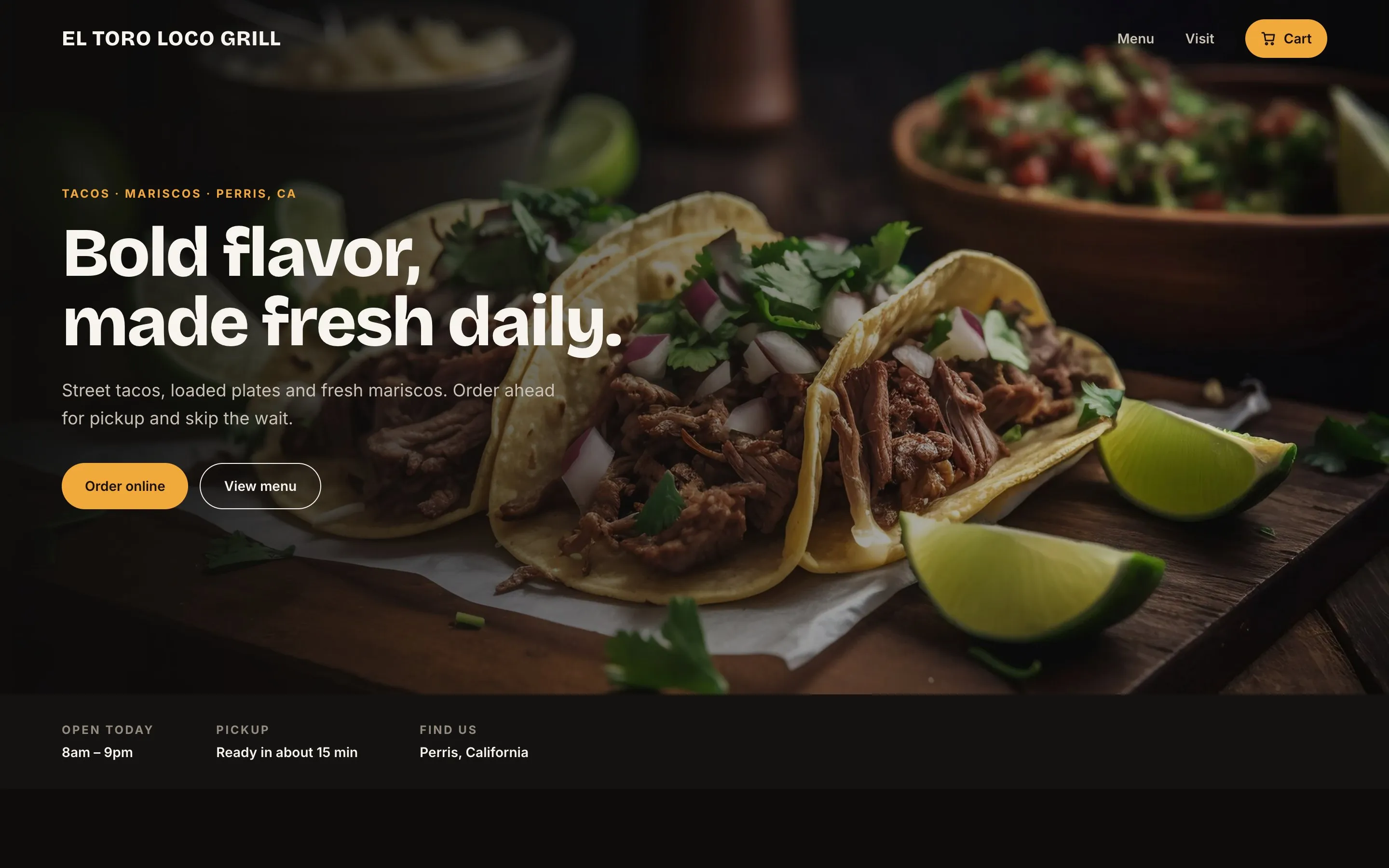
I first took a swing at this in 2025. Dark background, big food photos, a clear “Order Online” button. It looked a lot better than the real thing.
Looking back, though, I’d designed a homepage, not a way to order. The cart was one screen, the menu was still lorem ipsum, and nothing answered the questions you actually have when you’re hungry: what comes on it, can I add guac, when will it be ready?
Try it: drag to compare
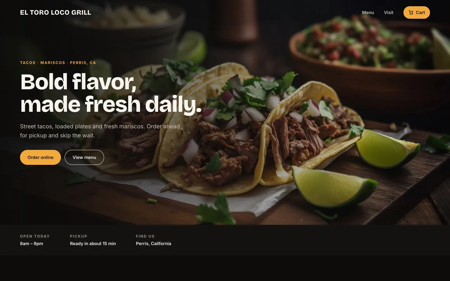 20252026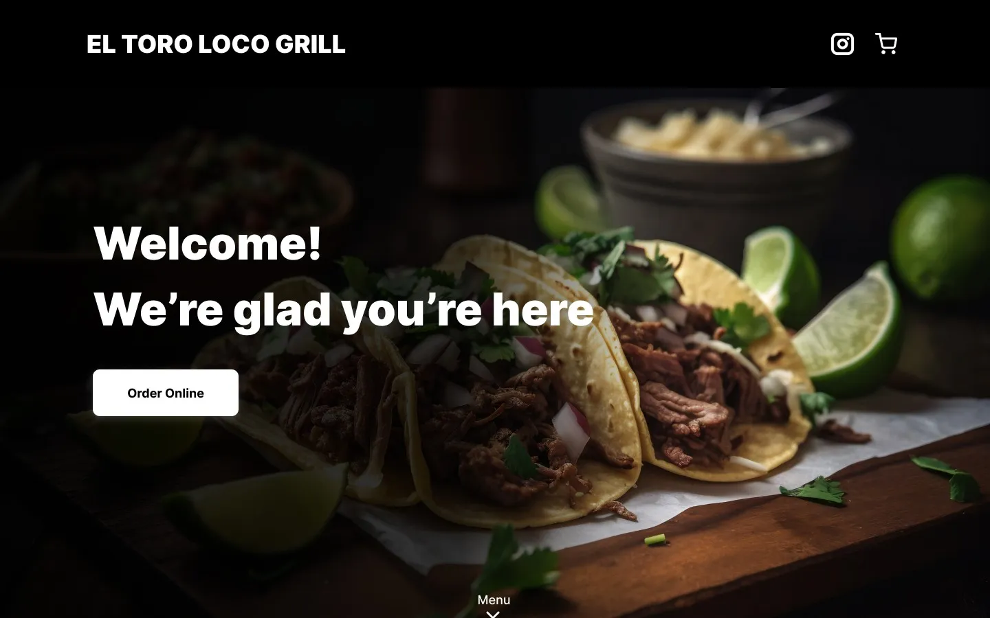
02 · Flow
Start with the order, not the homepage
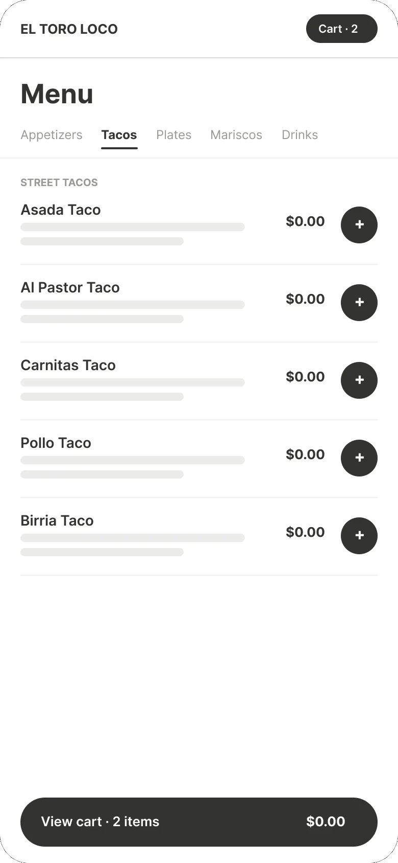
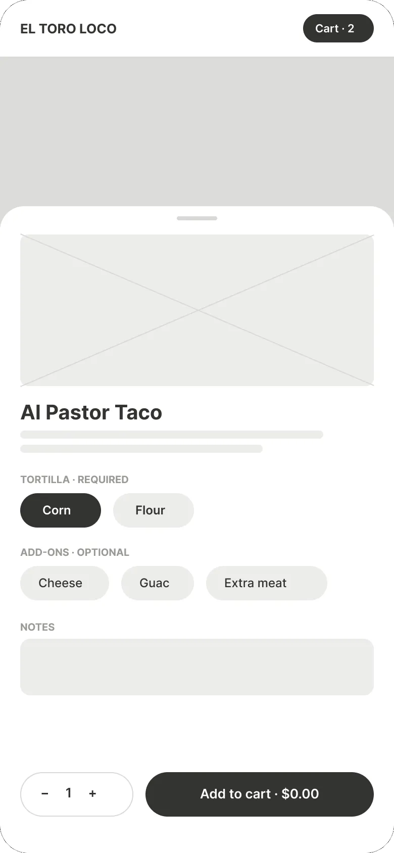
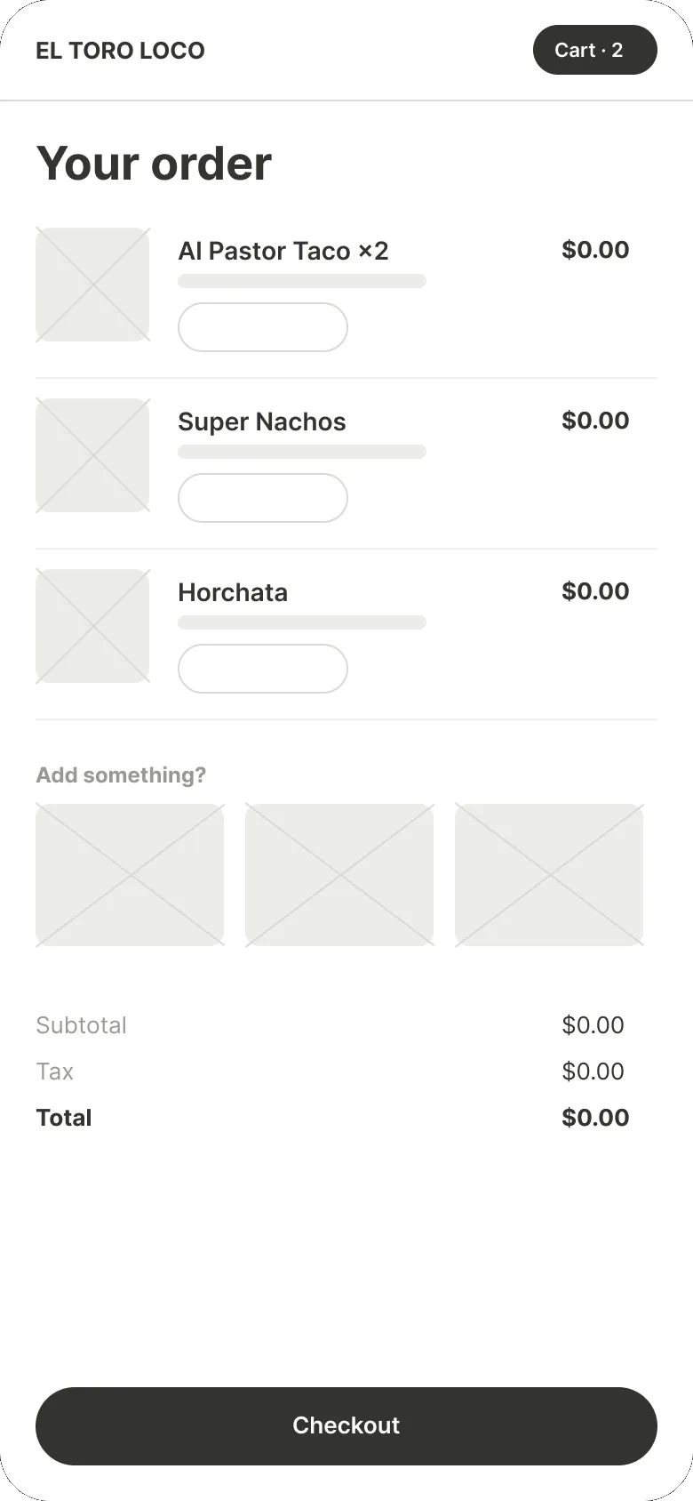
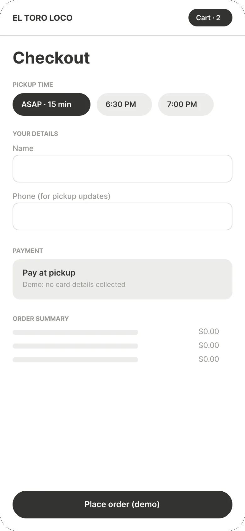
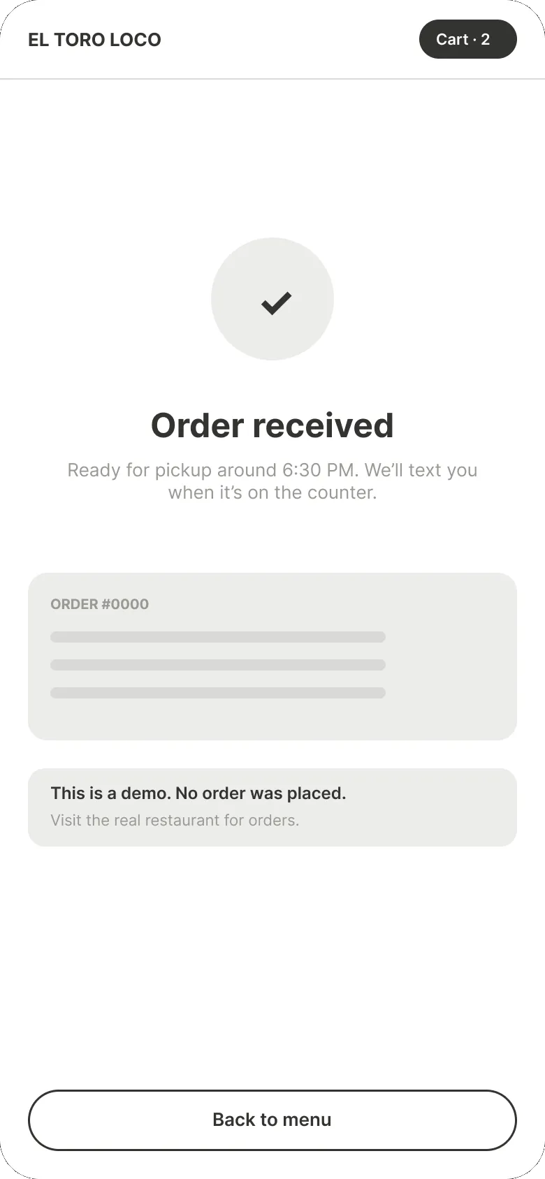
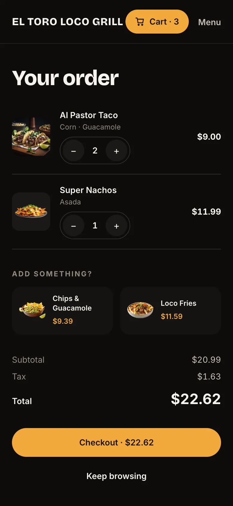
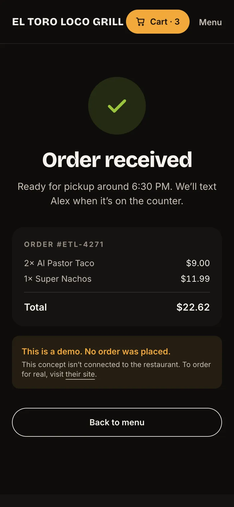
So for round two I flipped it. Before any colors, I sketched the whole pickup order on a phone in five screens: menu, item, cart, checkout, done.
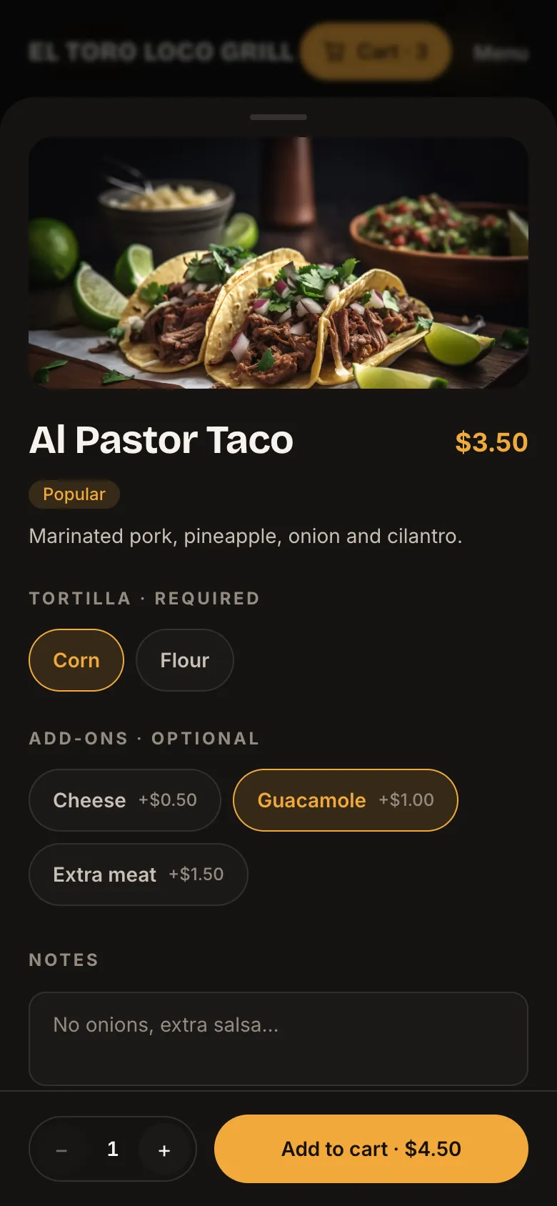
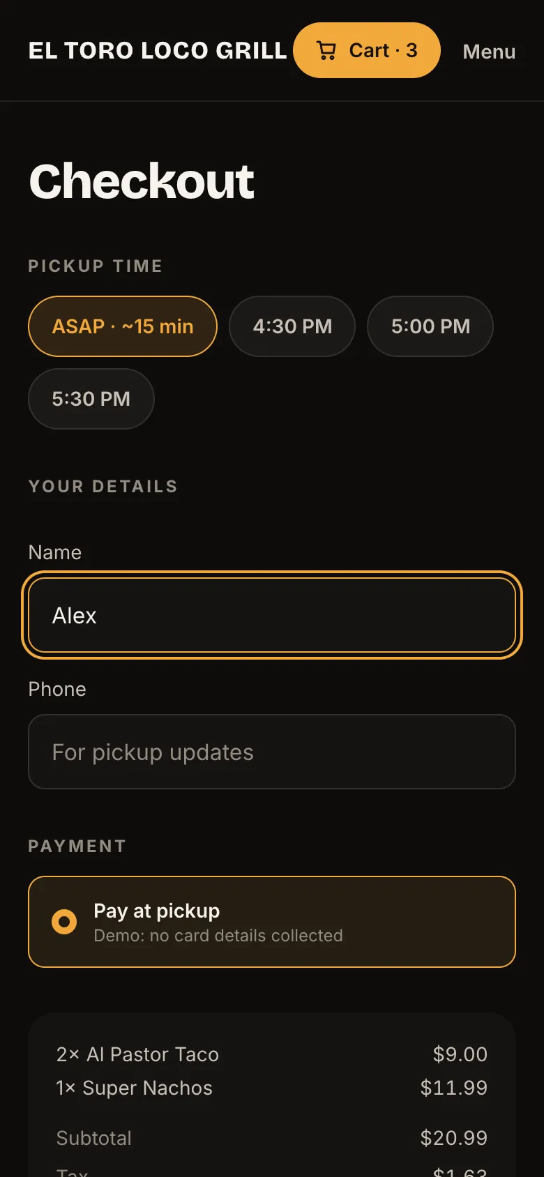
A few rules came out of that. Options open in a sheet so you never lose your place on the menu. Required choices come first. Checkout is pickup only, with three decisions: when, who, and how to pay. No account, no card form.
03 · Look & feel
Dark, warm and a little hungry
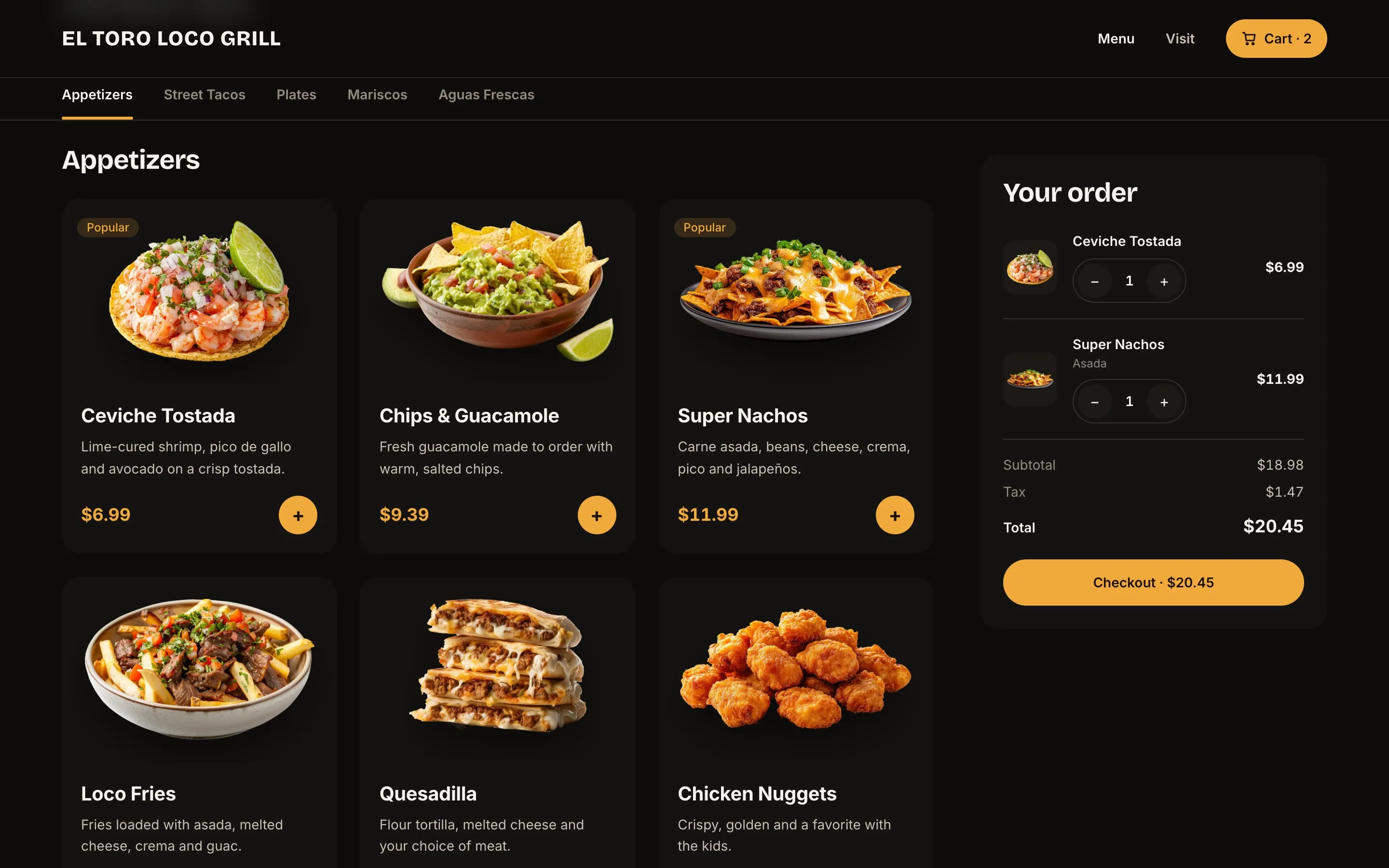
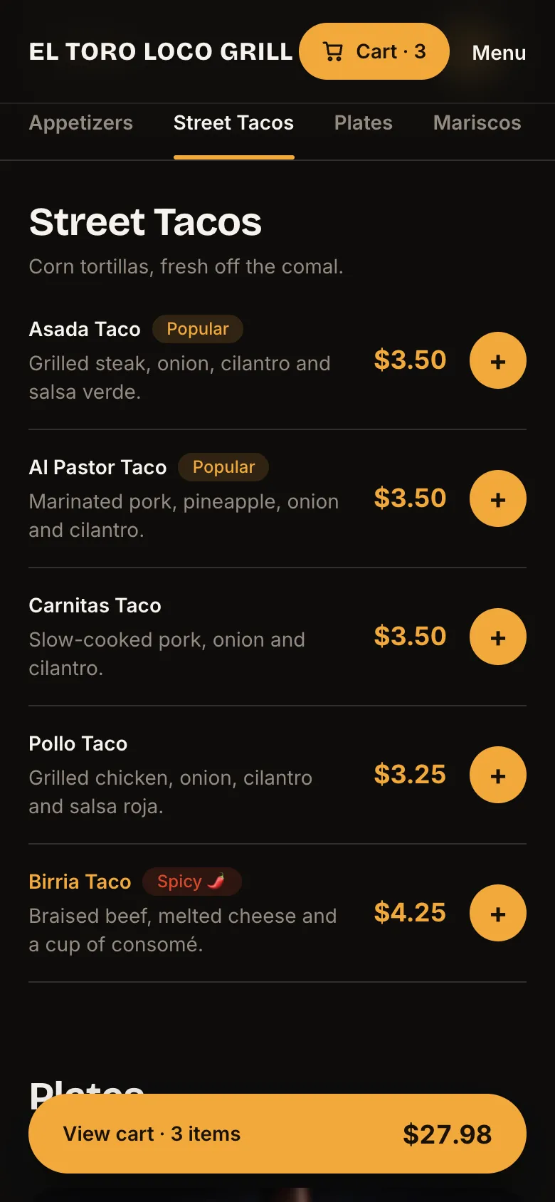
I kept the dark background from round one because it makes the food glow. Then I added one warm color, marigold, and gave it a job: anything you can tap or anything that costs money. Prices, buttons, the cart. Your eye learns where to go fast.
Headings got a chunkier font with some personality, and the dishes got cut out of their backgrounds so they pop off the cards.
04 · Try it
Go ahead, order something
This one’s live. Add a few tacos, customize them, and check out. It’s a demo, so nothing actually gets ordered, and no card details are ever asked for.
Try it: this is the real site
05 · Details
The small stuff that makes it feel easy
The category tabs follow you as you scroll. The cart pops a little when you add something, so you know it worked. Pickup times only show when the restaurant’s actually open. And if you forget your phone number, checkout tells you right there, not after you hit the button.
06 · Build
From Figma to a live site
Everything started in Figma: colors and type as variables, and 12 components like the menu card, the option chips and the cart line. Then I built it with AI tools like Claude Code, the same way I built this portfolio.
Since it’s a concept, I kept it honest. Every page says it’s not affiliated with the restaurant, the menu and prices are samples, and it’s hidden from search engines so it never competes with the real thing.
07 · Reflection
What I learned
Round one was me making it look good. Round two was me making it work. For a restaurant, ordering isn’t a feature on the website. It basically is the website.
Coming back to my own old work was humbling in a good way. It showed me how much I’ve grown, and it’s a reminder to always design the flow before the screens.