Case Study
Webair

Overview
Webair is a conceptual airline created to explore how brand identity can elevate a travel experience. As the solo designer, I was responsible for developing the entire visual language—from logo and color palette to custom patterns and branded collateral.
Objective
Design a comprehensive, future-forward airline brand that balances trust, innovation, and global accessibility. The goal was to craft a visual identity that could scale across various touchpoints while reflecting the spirit of travel and modern air transport.
Sketches & initial concepts

Research & Insporation
Before diving into design, I studied existing airline brands—focusing on typography, color psychology, and visual motifs that communicate safety, speed, and reliability. I also researched modern travel trends and how airlines create emotional connections with their customers through design.
This exploration led to several key themes that informed the brand direction:
Clean, modern geometry to suggest precision and motion
A fresh, trustworthy color palette inspired by sky, sea, and technology
Repeating patterns and motifs reflecting flight paths, destinations, and connection
The early phase involved loose sketching of logos, flight-related symbols, and abstract representations of air and motion. From these sketches, I refined a primary logo that felt simple, distinct, and versatile—capable of scaling across planes, tickets, and digital applications.


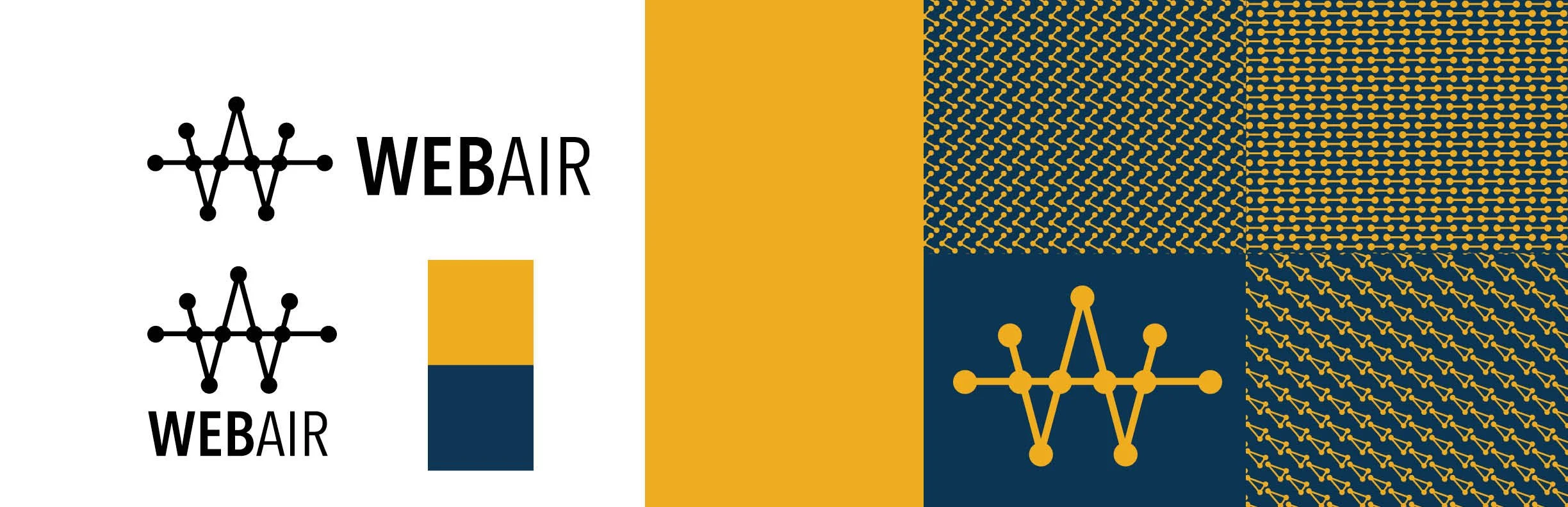
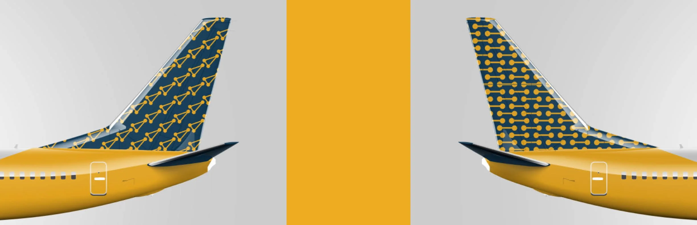
Final identity system
The final Webair branding package includes:
Primary Logo — a clean, minimal wordmark with custom geometry
Color Palette — modern blues and complementary neutrals evoking calm, clarity, and professionalism
Custom Patterns — geometric motifs inspired by maps, runways, and air routes
Branded Ticket Design — a sleek airline ticket mockup that demonstrates applied brand system
Merchandise — a Webair-branded tote bag showcasing the identity in everyday use
Marketing Collateral — print and digital ad mockups that emphasize clarity, movement, and aspirational travel


Reflection
This project pushed me to think holistically—beyond just a logo—about how a visual identity system builds brand recognition and emotion. It sharpened my skills in systems thinking, layout, and application design.
If expanded further, I’d explore environmental branding (e.g., airport signage) and extend into motion-based design like animated ads.