Nuvem
Soft forms for thoughtful spaces
What: A study in visual calm, Nuvem reimagines everyday furniture through the lens of softness, balance, and modern minimalism. The project explores how form and light can work together to create emotional comfort in a space.
Why: Many furniture brands focus on function or style, but few bridge both emotional comfort and modern simplicity. Nuvem was created to explore how gentle curves and natural tones can create a sense of “cloud-like calm” in any room.
Tools: Adobe Dimension, Figma, Framer
Role: Product Designer
Project Overview
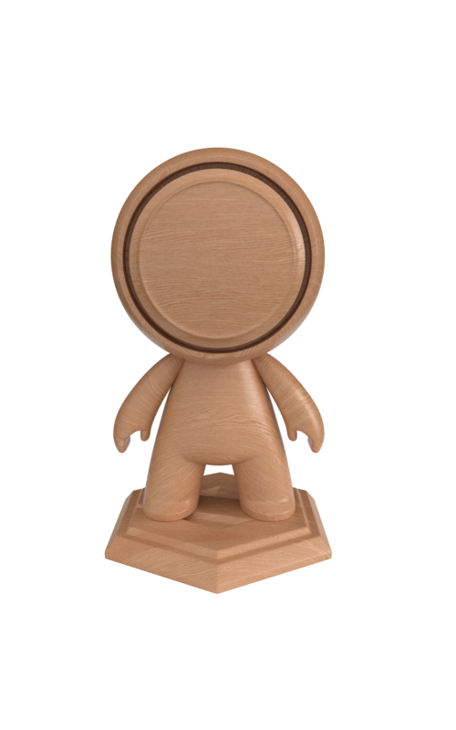
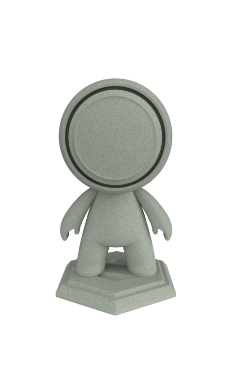
Nuvem began as a creative study in how form and atmosphere work together to influence mood. Rather than modeling from scratch, I curated a selection of pre-made 3D furniture pieces and re-styled them, refining their materials, lighting, and presentation to create a cohesive visual story.
The project’s purpose was to learn how to craft mood and identity through composition and tone showing how minimal design can still feel rich, tactile, and human.
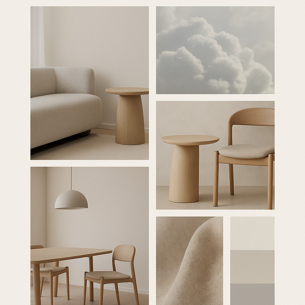
Visually, Nuvem was guided by the idea of “calm through design.” Every creative decision from typography to lighting was made to support that feeling. The brand aesthetic combines soft geometry, warm neutrals, and diffused light to express a sense of serenity and presence.
Nunito
Poppins
Concept & Inspiration
The name Nuvem means “cloud” in Portuguese, symbolizing lightness, calm, and movement. The visual language draws from nature: how light diffuses through mist, how stone smooths over time, and how calm space invites rest. It’s design as atmosphere, minimal, soft, and intentional.

Design Process
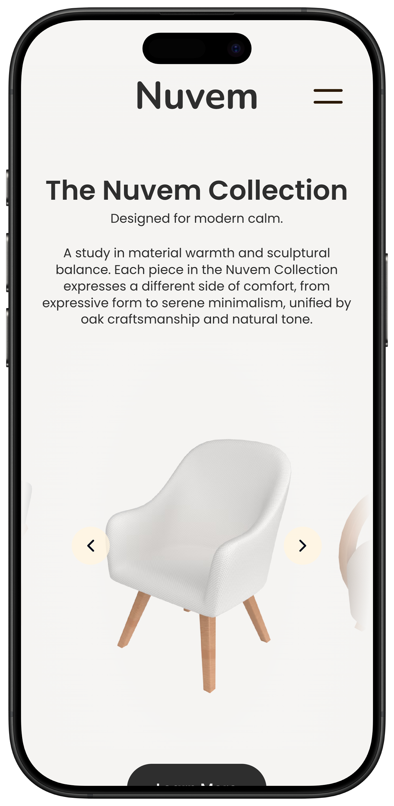
Bringing Nuvem to the web meant translating its calm, minimal aesthetic into a digital experience.
The goal was to create a website that feels as serene as the furniture itself, light, spacious, and intentional in every interaction.
The design process began with simple wireframes to explore structure and rhythm. Each layout was built around whitespace and balance, allowing content and imagery to breathe.
Typography and motion played a key role in shaping the tone, using Nunito for its softness and rounded warmth, paired with subtle transitions that guide the eye without distraction.
Color and composition mirrored the physical brand language: neutral backgrounds, soft typography, and muted sand accents for hierarchy. The result is an interface that feels tactile yet effortless, like the furniture pieces it represents.

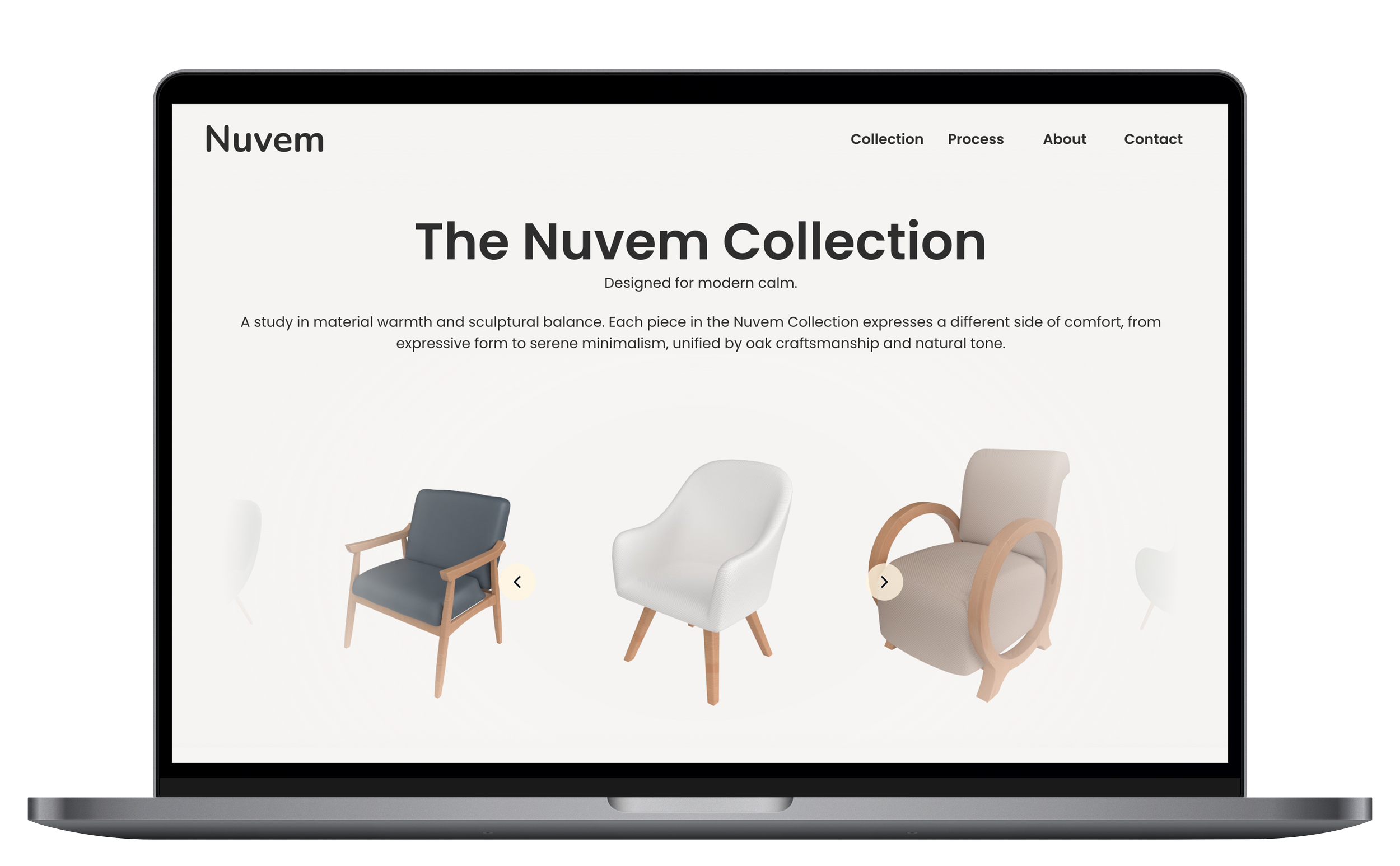
Final Design
The final Nuvem experience translates the brand’s calm visual language into both product and digital form.
Each element, from the sculpted chairs to the minimal interface, reflects the same balance of softness, space, and intention.
The website presents the collection with quiet confidence: generous white space, smooth transitions, and a focus on material tone rather than visual noise.
Every page is designed to feel light and effortless, letting the furniture speak through light, texture, and rhythm.
Reflection
Nuvem became more than a styling study, it was a lesson in restraint.
By refining existing assets and focusing on light, composition, and brand tone, I learned how digital design can express the same calm presence as physical form.