Drink Company
A Digital Experience for a Modern Beverage
What: Conceptual project designing and developing a digital experience for a new beverage brand.
Why: To explore how design and code can blend to create an immersive, branded user experience.
Tools: Figma, Adobe Dimensions, VS Code, GitHub, ChatGPT(for code guidance & troubleshooting.
Role: Product Designer, Front-End Developer.
Project Overview
This project explores how brand, interface, and motion can work together to create an immersive digital experience. I focused on designing the home screen and UI animations, then brought them to life through front-end code to ensure every detail felt intentional.
Goal: Design and code a conceptual home screen that reflects the product’s personality.
Focus Areas: Branding, UI design, interaction, motion design, front-end development.
Deliverables: Responsive web layout, motion prototype, coded demo.
Poppins
The Challenge
Beverage brands compete not only on taste but on lifestyle. Many brand sites feel static, even though their products are energetic and expressive. My challenge was to design and code a experience that feels alive, crisp, and interactive. Mirroring the refreshment of the drink itself.

Most beverage sites focus on visuals, not experience
Research & Insights
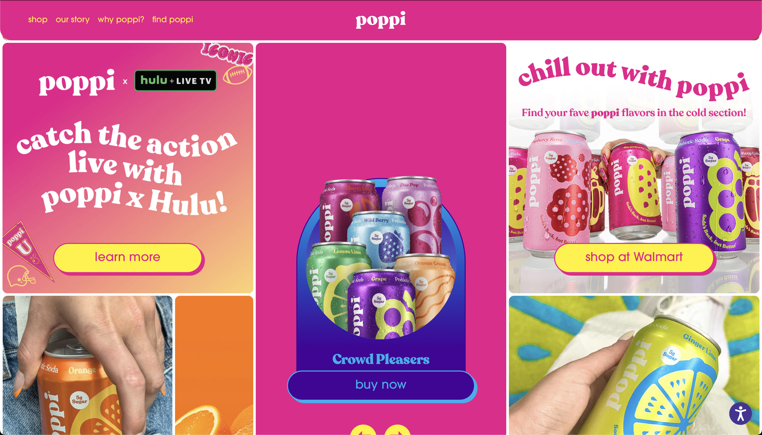
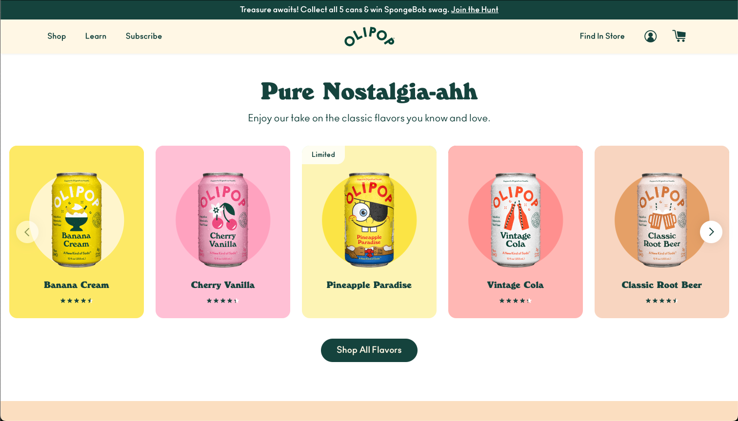
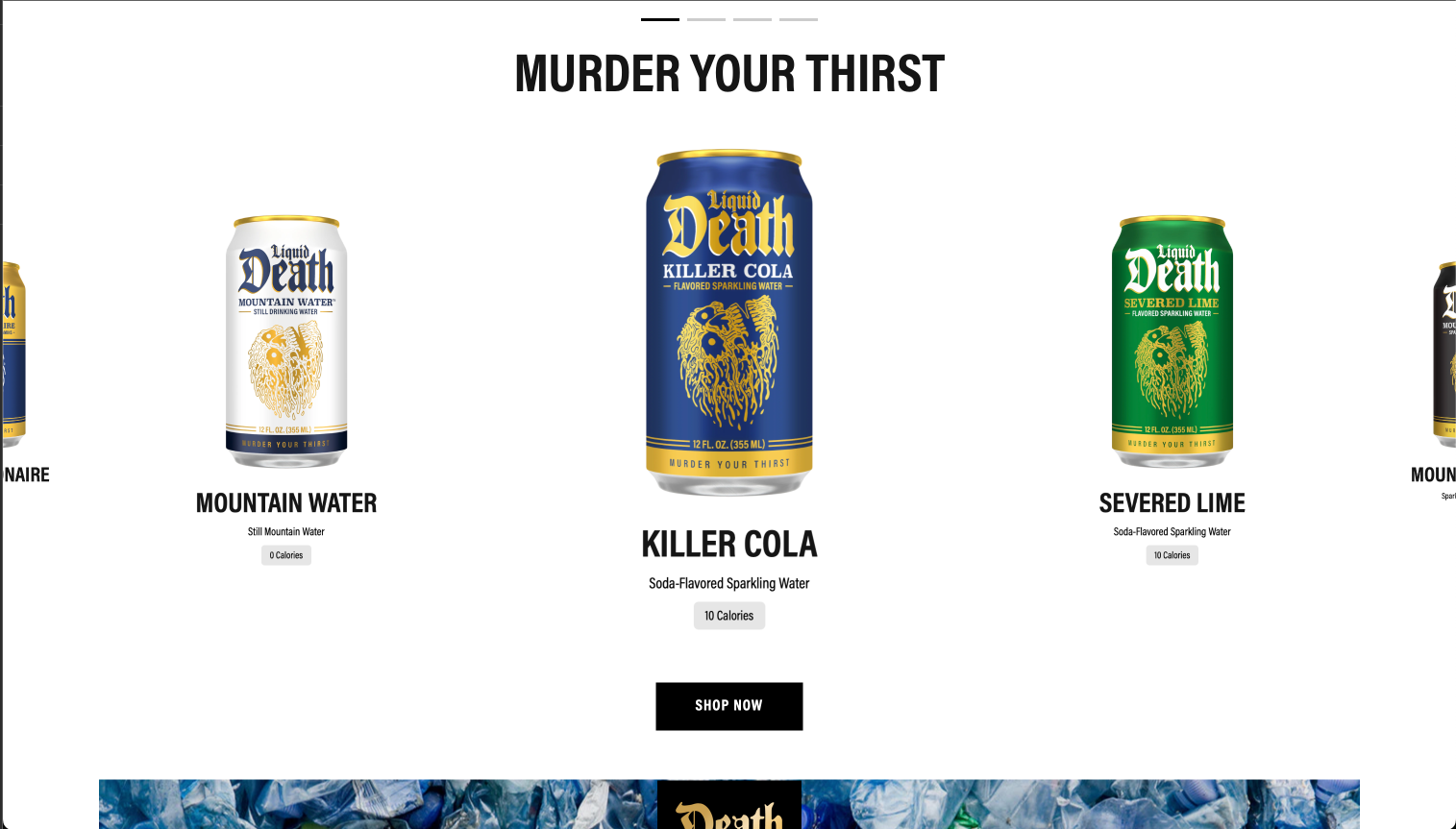
I analyzed beverage brands like Poppi, Olipop, and Liquid Death to understand how they use storytelling and visual identity. My key insight: while most rely on static imagery, few use motion or interactivity to communicate brand energy.
Consumers connect emotionally with personality-driven brands.
Motion can replace cluttered UI elements to guide attention.
Playful micro-interactions enhance brand memorability.
Immersive
Playful
Static
Design Goals
From these insights, I defined three goals for the drink experience:
Express the brand’s freshness through motion and layout.
Create intuitive, minimal navigation.
Design a coded prototype that bridges visual and functional design.
Concept Development
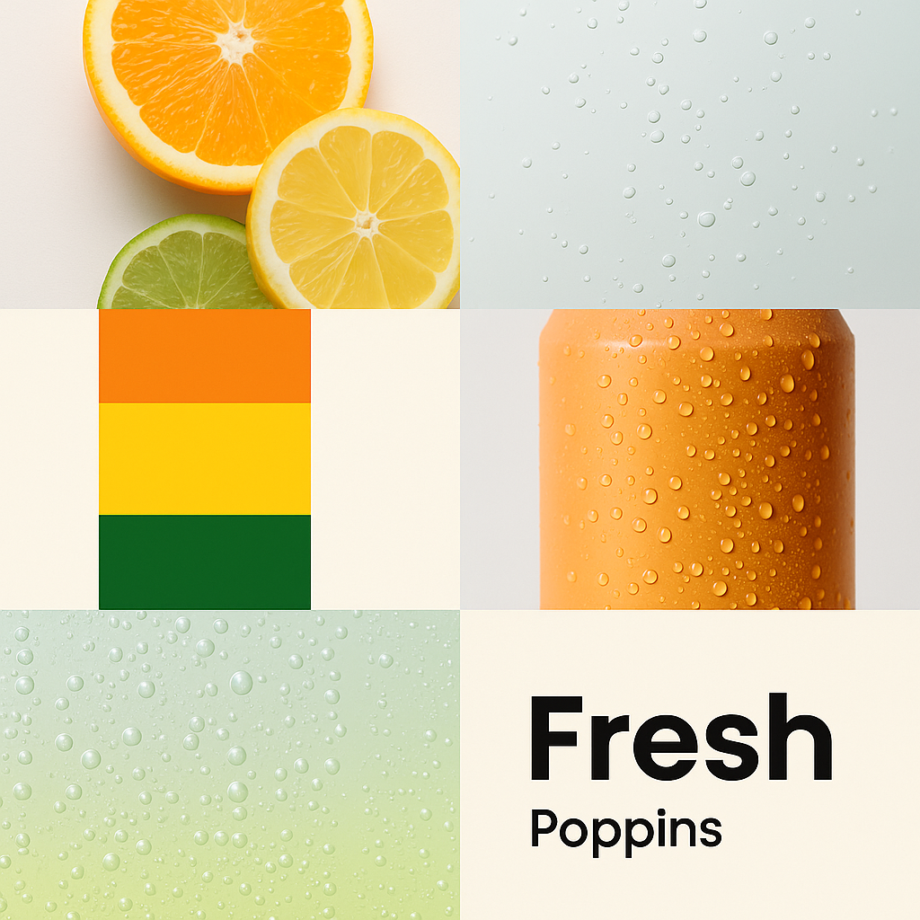
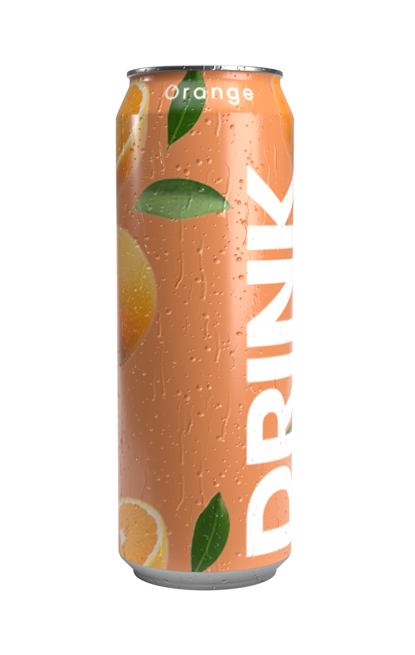
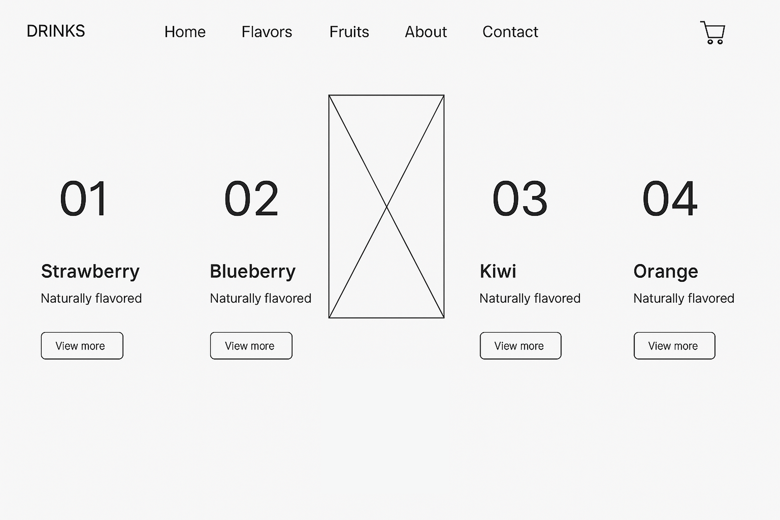
I started by exploring color palettes inspired by citrus tones, bright yet clean. The layout needed space to breathe, allowing the product and brand story to shine. Early wireframes focused on hierarchy: product first, lifestyle second, and CTA clarity.
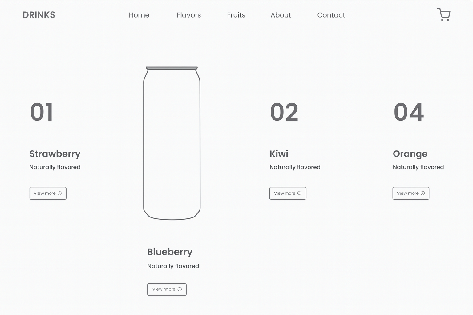
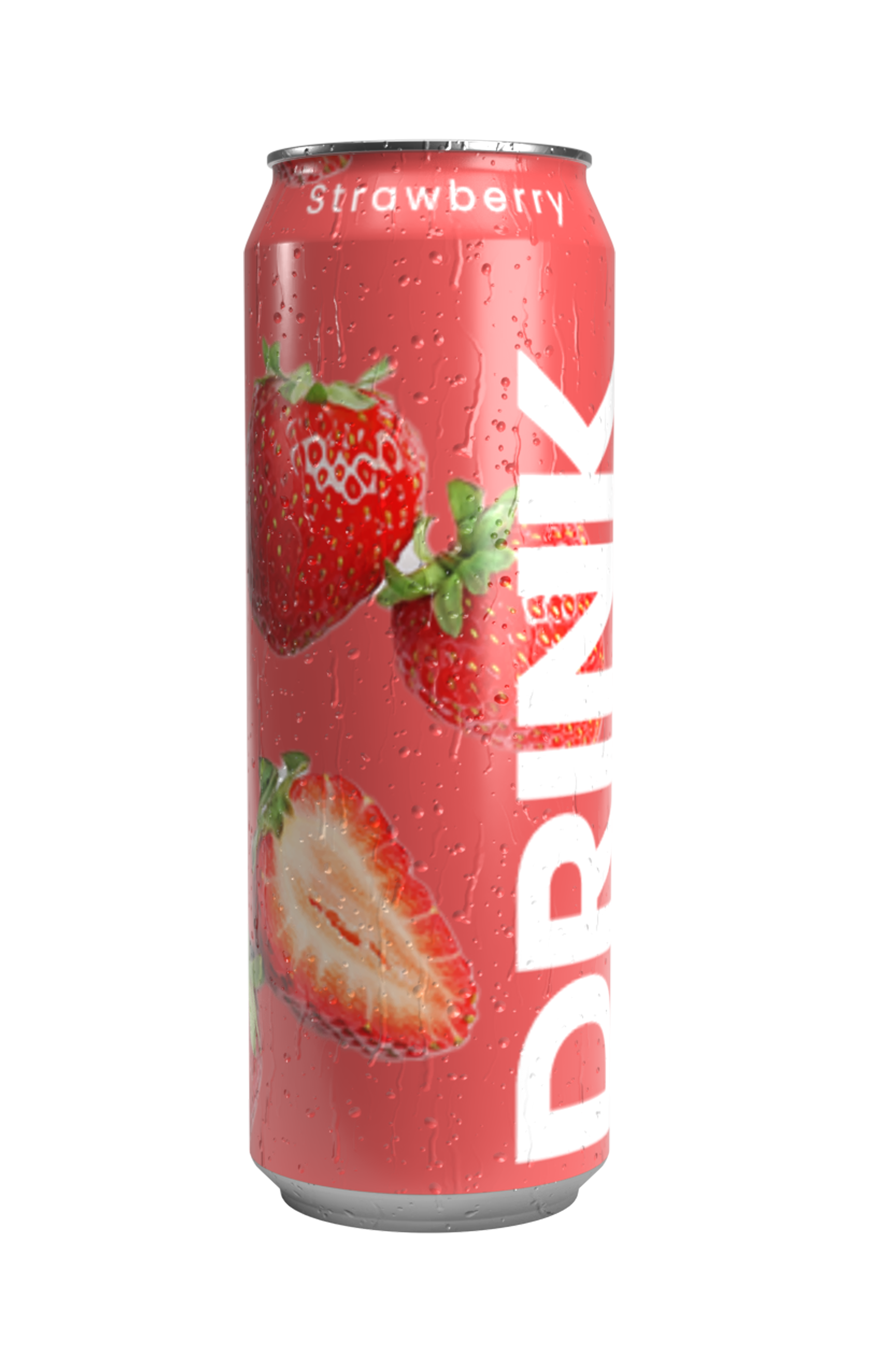
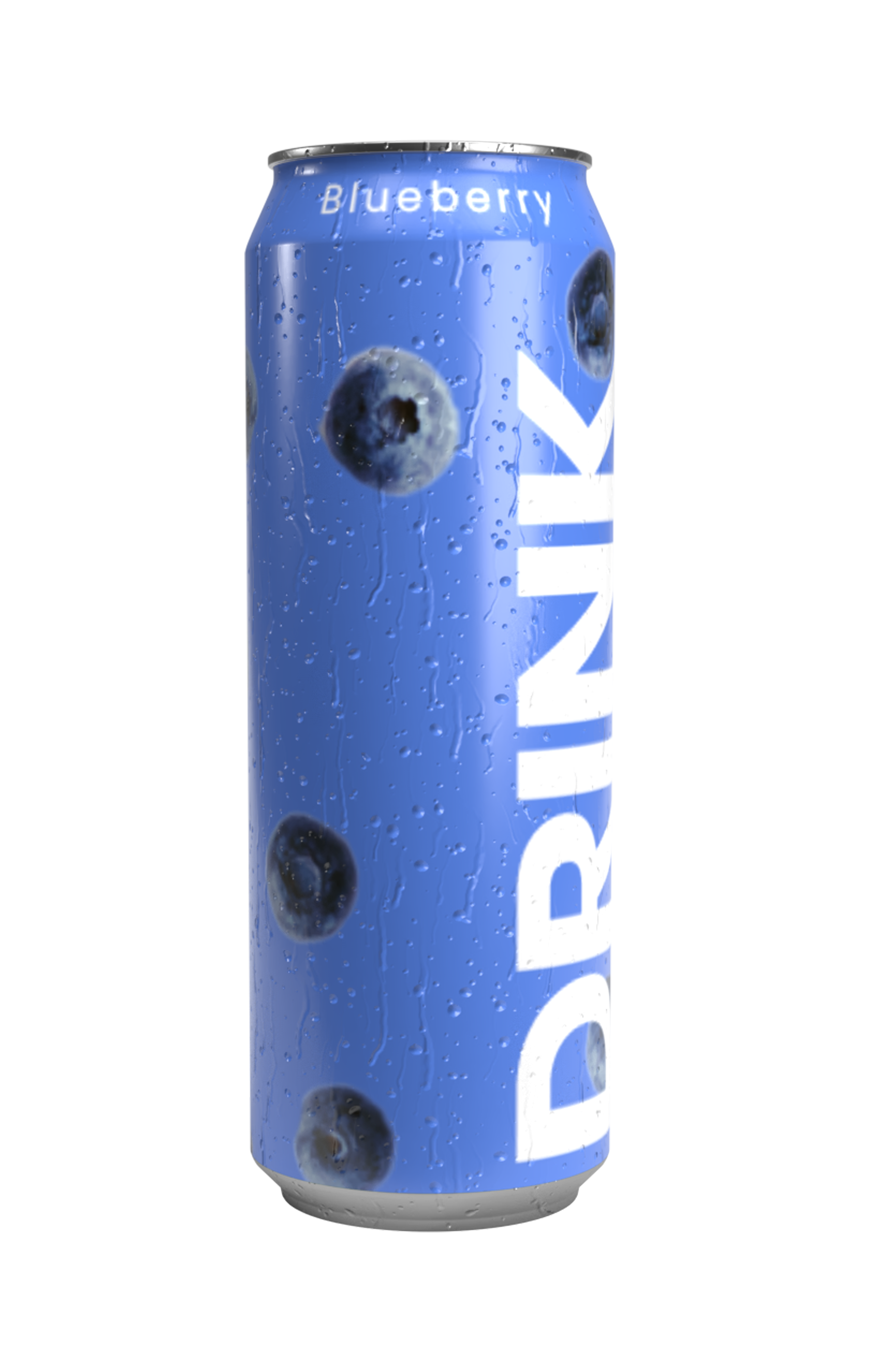
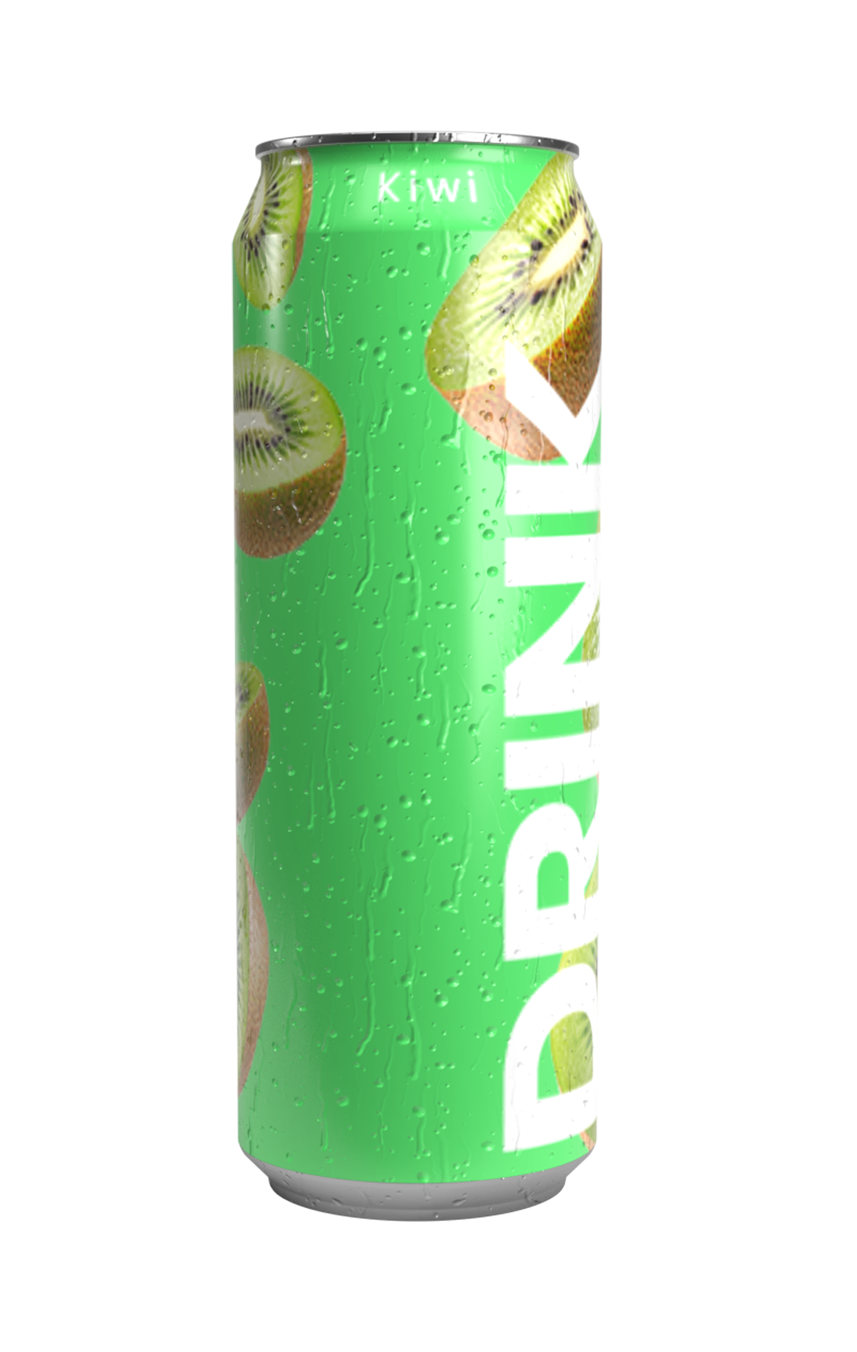
Final Design and UI Animation
The final home experience opens with a clear minimal layout, a single can emerging through subtle motion with droplets of condensation. The navigation animates in seamlessly, and micro-interactions throughout keep the interface feeling light and fresh.
Motion is used not for decoration but as guidance transitioning between sections and highlighting key product features.
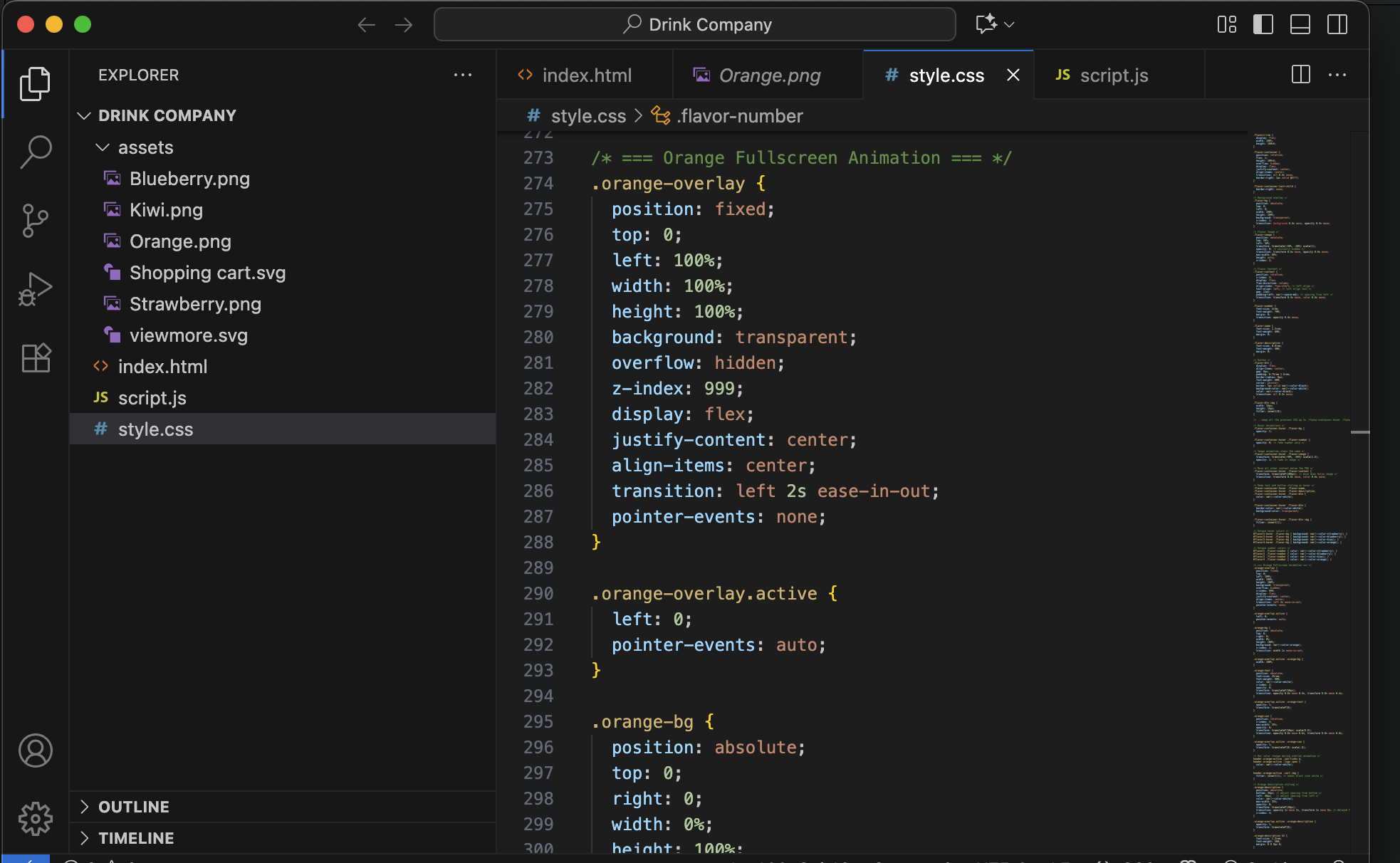
From Design to Code
To translate the experience into reality, I coded the design using HTML, CSS, and JavaScript. This allowed me to fine-tune transitions, timing, and easing for a more realistic and controlled result.
Coding the site gave me a deeper understanding of how motion behaves in a live environment, ensuring the design’s intent carried through to the browser.
This project taught me how to connect brand storytelling with real, interactive execution. By controlling both design and code, I could ensure every motion and transition reflected the product’s energy.”
Bridging design and code speeds up iteration.
Subtle animation increases perceived quality.
Visual simplicity can still evoke brand personality.